Speed Lettering 03 [Column_Letters & Figures]
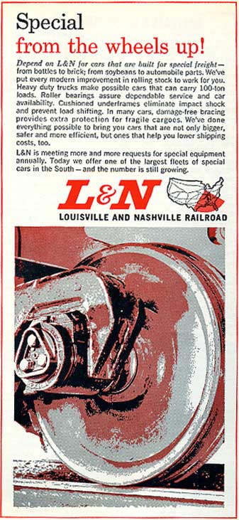 : L&N ad appeared in Sep. 1964 issue of Trains
Today, logos using italic fonts have a sense of speed, represented by its name "Speed Lettering" or "Flying".
Speed has a direction. So, the speed lettering would have a direction, either to the right or to the left.
The flying Rio Grande has a direction to the right, as I mentioned before. In this case, the letters leans forward. In other case, like JFR locomotive in Japan, the letters leans backward.
Here, we can find that the speed lettering can obtain both directions.
Direction of the Rio Grande logo;
http://riogrande.blog.so-net.ne.jp/2010-02-12
Speed lettering on JFR loco;
http://riogrande.blog.so-net.ne.jp/2010-05-08-1
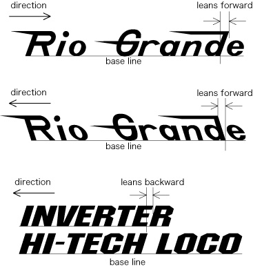 : relations between the direction of train and the letters
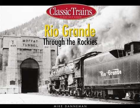 : forward leaning Rio Grande logo appeared on the cover of the book "Rio Grande Through the Rockies" by Mike Danneman, Kalmbach Books, 2002
今日、イタリック書体を用いるロゴは速度や動きの表現といった要素をもつ。速度や動きといった要素には方向性がある。横書きのロゴなら、向かってどちらの方向への動きを表現するといえるか。この方向とは、文字列をどちらから読むかといった次元とは異なる、デザインがもたらす方向性の話である。
先に記したように、Rio Grandeのロゴでは、向かって右方向への動きが見出されていたと考えられる。この場合、文字はいわば前のめりの姿勢にある。仮にこれを前傾書体とする。
一方、例えば京阪特急「テレビカー」の書体は、1号車を前、運転席側を公式側とするなら、向かって左方向への動きを表している。JR貨物の機関車も同じである。この場合、文字は後ろにのけぞった姿勢にある。仮にこれを後退書体とする。すると、同じイタリック書体であっても、前傾書体と後退書体では全く逆の方向性をもつことが分かる。
2010-05-12 09:42
コメント(0)
トラックバック(0)
arx_Ph.D. さん

Here represented are my model railroad enthusiasm generated from the photos I took during my childhood at Knoxville, Tennessee, or from the photos I took during my recent trips.
I'm a retired professor of design, meanwhile a part-time associate at the architectural design office in Osaka, Japan where I live with my wife.


コメント 0