Speed Lettering 10 - Art Deco and the 50's [Column_Letters & Figures]
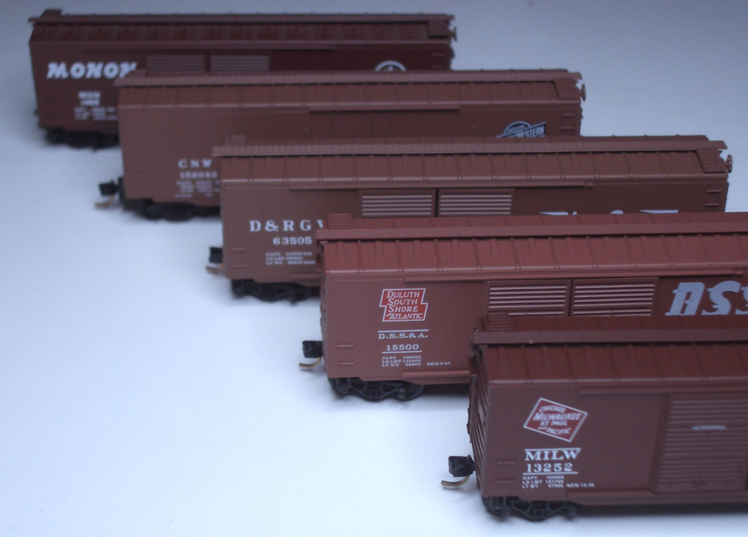 : boxcars decorated with italic fonts produced by MTL
In the book “The Elements of Typographic Style ver.3.2” (2008、Robert Bringhurst), Robert introduces about 90 italic fonts.
I drew a graph representing the age when these fonts were produced. According to the graph, there are 3 peaks: 20's and 30's, 50's and 80's and after. The '20s and '30s are the Art Deco period. The '50s is the “fifties” period. Both the peaks represent the period when American design swept over the world. Thus, we can say that the demand for the italic fonts was increased in those ages.
As there is a relationship between American design and Italic fonts, let’s look into the history of italic fonts used in the railroad logo.
The year class 1 railroads adopted italic fonts to their logos are:
In 1891, Chicago and North Western Transportation Company*1
In 1895, Great Northern Railway*2
In 1905, Duluth, South Shore and Atlantic Railway*3
At least in 1922, Chicago, Milwaukee, St. Paul and Pacific Railroad*4
At least in 1925 (maybe in the 19c), Minneapolis, St. Paul & Sault Ste. Marie Railway (Soo Line) *5
At least in 1928, Chicago and Illinois Midland Railway*6
At least in 1940, Chicago & Eastern Illinois Railroad*7
In 1940, Denver and Rio Grande Western Railroad*8
In 1946, Monon Railroad*9
In 1952, Western Maryland Railroad*10
and so on
Here we can find that the comparatively many “speed lettering” was introduced before/in the Art Deco period.
Reference:
*1 http://www.cnwhs.org/ch_cnw.htm
*2 http://www.greatnorthernempire.net/index2.htm?GNEGNTimeline.htm
*3 http://dssa.habitant.org/logos.htm
*4 according to the system map printed in 1922
http://www.periodpaper.com/index.php/art-type/map/1922-map-chicago-milwaukee-st-paul-railway-train-routes
*5 according to the timetable printed in 1925
http://www.collectionscanada.gc.ca/comics/027002-150.1-e.php?uidc=CollectionCd&sk=111&&&&&&&&&&&&PHPSESSID=8vn90p3vqbokdm02darausd6f0
*6 according to the timetable printed in 1928
http://www.hydroponicsonline.com/store/1928-CHICAGO-ILLINOIS-MIDLAND-RAILWAY-SCHEDULE-BOOK-NR_220793129829.html
*7 according to the timetable printed in 1940
http://www.r2parks.net/c&ei.html
*8 The Prospector, vol.2, No.1
*9 http://images.indianahistory.org/cdm4/item_viewer.php?CISOROOT=/V0002&CISOPTR=1719&CISOBOX=1&REC=3
*10 http://www.alphabetroute.com/wm/protopaint.php
前回挙げたタイポグラフィーの本「The Elements of Typographic Style ver.3.2」(2008、Robert Bringhurst著)には、代表的と思われる斜体がおよそ90点紹介されている。
今度は、それらを制作年代ごとに分類する。結果をグラフで示すと、1920〜1930年代、1950年代、そして1980年代以降にピークを見ることができる。1980年代以降のものが多い理由は、1992年初版の書籍だからだろう。このピークを除けば、他ふたつのピークは、いずれもアメリカで流行ったデザインが世界を席捲した時代にある。すなわち、1920〜1930年代はアール・デコ、1950年代は文字通りフィフティーズである。したがって、斜体の需要はこの2つの時代に高まったことが分かる。
上に示したように、斜体およびアメリカにおけるデザインの間には、ある関係性を見いだすことができる。斜体のみかけの運動による効果はスピード感だとされるので、スピード感に近しい鉄道会社のロゴを事例に、斜体およびスピード感の歴史的経緯について考察してみる。
北米における鉄道会社は、その営業収益の規模によってランク分けされる。もっとも規模の大きいランクをクラス1という。
クラス1に分類される鉄道会社の中で、斜体を用いたロゴを導入したのは、
Chicago and North Western Transportation Company(1891年導入)をはじめ、
Great Northern Railway (1895年導入)、
Duluth, South Shore and Atlantic Railway(1905年導入)、
Chicago, Milwaukee, St. Paul and Pacific Railroad(1922年以前に導入)、
Minneapolis, St. Paul & Sault Ste. Marie Railway (Soo Line)、(1925年以前に導入)、
Chicago and Illinois Midland Railway(1928年以前に導入)、
Chicago & Eastern Illinois Railroad (1940年以前に導入)、
Denver and Rio Grande Western Railroad(1940年導入)、
Monon Railroad(1946年導入)、
Western Maryland Railroad(1952年導入)などと続く。
このように、アール・デコの時代またはそれ以前に、比較的多くの鉄道会社がロゴに斜体を用いるようになったことが分かる。
2011-08-05 20:35
コメント(0)
arx_Ph.D. さん

Here represented are my model railroad enthusiasm generated from the photos I took during my childhood at Knoxville, Tennessee, or from the photos I took during my recent trips.
I'm a retired professor of design, meanwhile a part-time associate at the architectural design office in Osaka, Japan where I live with my wife.


コメント 0