Speed Lettering 12 – railroads and italics [Column_Letters & Figures]
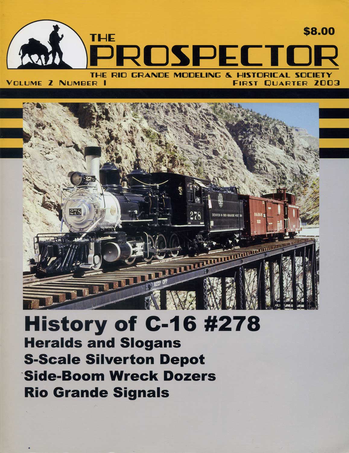 : The Prospector featuring the history of Rio Grande logo
Here is the summary for this discussion.
Italic fonts didn’t have the meaning or the intention of speed or dynamics at their origin. Comparatively many italic fonts were produced in the ‘20s and ‘30s, the Art Deco period. In the United States, italic fonts were adopted by the railroad industry as a logo, going ahead of other transportation related industries. Today, it is said that italic fonts have the meaning of speed.
If we read this summary from the end against the time series, we can find a fact: italic fonts gained the meaning of speed since the railroad industry adopted them to their logos. Is that true?
I know there would be exceptions because I didn’t research all the logos. But the logos of class 1 railroads using italic fonts would play a big part in the italic fonts’ gaining the meaning of speed among the transportation related industries because of their degree of exposure to the citizens of the United States. Now, I may say that the meaning of speed of the italic fonts was generated when railroads began adopting them to their logos.
Wait, how should we treat the psychological explanations? According to the psychological explanation, oblique directions or positions automatically generate the image of speed. Quoting this explanation, italic fonts should have gained the meaning of speed at their origin.
Here, I quote the psychoanalysis to explain this contradiction. According to the psychoanalysis, time series does not exist in our unconscious. This means that the cause would follow the result. Italic fonts’ meaning of speed was gained at their origin, but maybe in our unconscious. Railroad industry dragged it out from our unconscious by adopting them to their logos.
Finally, we can say that the italic fonts’ meaning of speed was recognized when railroad industry adopted them to their logos.
斜体に、当初から「スピード」あるいは「躍動」といった意味あるいは意図が備わっていた訳ではない。比較的多くの斜体が1920〜30年代、すなわちアール・デコの時代にデザインされた。アール・デコの時代とは速度への要求が高まった時代である。北米では、他の交通機関に先駆けて、鉄道会社のロゴに斜体が導入された。今日では斜体にはスピード感があると一般的にいわれる。これまでに記した内容を要約すれば、このようにまとめられる。
この歴史叙述を、時間系列をさかのぼり読んでみる。すると、北米において斜体にスピード感が備わったのは、鉄道会社がそのロゴにそれを用いるようになったからだと読める。すなわち、少なくとも北米交通機関のロゴにおける斜体に備わるスピード感のイメージは、鉄道会社によってもたらされたと読める。
もちろん、すべてのロゴを調べた訳ではないので、例外事例もあるだろう。しかし、広く社会が斜体にスピード感を覚えるには、クラス1鉄道会社のような比較的露出度の高い媒体が果たした役割を認めてもよいだろう。したがって、斜体がスピード感のイメージを獲得するにあたって、鉄道会社はある役割を果たしたといえる。
と、ここまで記してきたが、この結論は心理学における「斜めの方向、位置」による効果の話と矛盾する。心理学によれば「斜めの方向、位置」は自動的にその効果を発揮するからである。したがって、厳密にいうなら、鉄道会社がロゴに斜体を用いることによって、鉄道会社自身を含む社会は斜体にあらかじめ備わっていた性能を事後的に見いだしたというべきだろう。
歴史とは事物の因果関係を明らかにする叙述だといえる。しかし、この例からも分かるように、原因と結果が時系列に沿ってあるとは限らない場合がある。すなわち、原因(この例では斜体のもつ効能)が、結果(斜体を用いた鉄道会社のロゴ)のあとからやってくることがある。そこが歴史の面白いところである。
2011-08-19 22:13
コメント(0)
arx_Ph.D. さん

Here represented are my model railroad enthusiasm generated from the photos I took during my childhood at Knoxville, Tennessee, or from the photos I took during my recent trips.
I'm a retired professor of design, meanwhile a part-time associate at the architectural design office in Osaka, Japan where I live with my wife.


コメント 0