Speed Lettering 18 – Historical Inclination of Italic Fonts Production [Column_Letters & Figures]
 : two books on history of font design
In the previous column, I represented a relation between the train speed and the speed lettering. According to my previous survey, this relation was generated unnoticed. Then, when the relation was noticed? Here I look back the history of italic font to find it out.
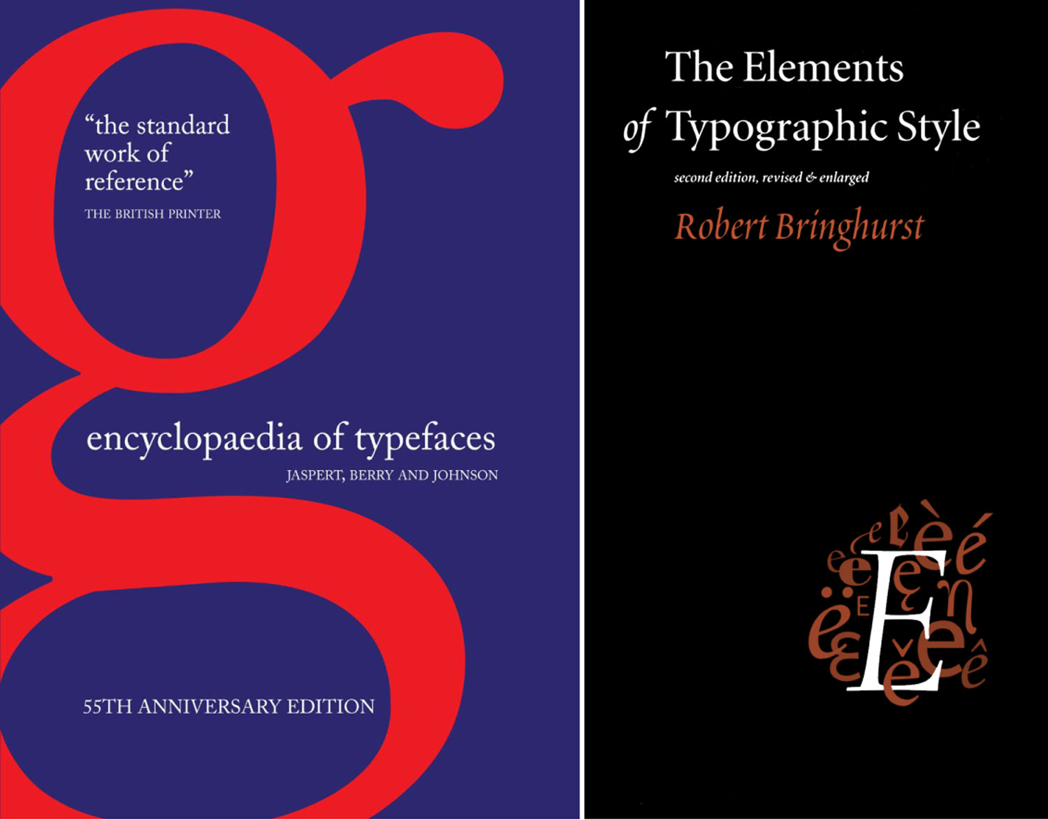
I used two books introducing the history of font design. One is the “ENCYCLOPAEDIA OF TYPE FACES” (by Jaspert, W. 1986), and the other is “The Elements of Typographic Style” (by Bringhurst, R. 2008). Each book introduces as many as 276 and 87 italic fonts.
I took the angles of inclination of italic fonts introduced in these books. My supposition is that if the italic fonts’ inclination and speed had some relation, the inclinations might grow large concurrently with the growth of speed.
By the book “ENCYCLOPAEDIA OF TYPE FACES”, the correlation coefficient of the year of production and the inclination was -0.32. By the book “The Elements of Typographic Style”, the correlation coefficient of the year of production and the inclination was -0.10.
The correlation coefficient represents how deep the relation is by figures between -1.0 and +1.0; zero represents the least. Figures -0.32 and -0.10 mean that there is little relation between them. Therefore, I may say that the inclination of italic font doesn’t grow large, or, the inclination is unrelated to the speed.
my previous column on speed lettering;
http://riogrande.blog.so-net.ne.jp/2011-08-19

: the correlation in “ENCYCLOPAEDIA OF TYPE FACES”
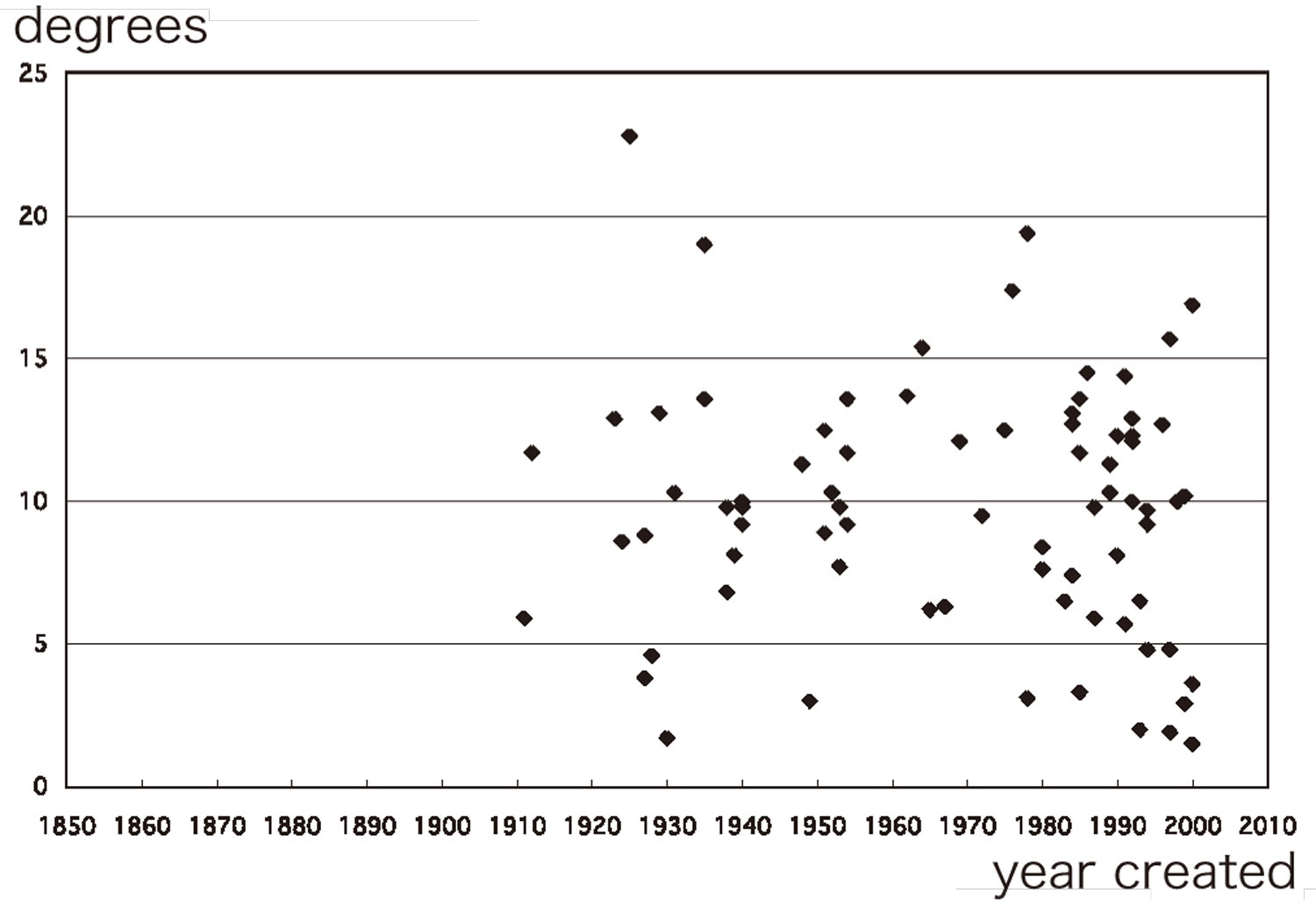
: the correlation in “The Elements of Typographic Style”
以前、「斜体に、当初からスピード・躍動といった意味・意図が備わっていた訳ではない」という考察を記した。今回の記事はそれの続編である。今回考察するテーマは、ではいつ頃から斜体にスピードという意味が備わったのか、という問いである。
心理学によれば、ひとは尖った図像にみかけの運動を覚え、スピード感というイメージを抱くという。斜体を尖らすのは傾斜角である。したがって、傾斜角が大きいほど、その斜体がもたらすイメージも増すと思われる。
一方で、ひとが抱くスピード感というイメージは時代と共に変化するだろう。馬車より速いものがなかった時代に比べ、新幹線のある時代ではスピード感というイメージにおける速度も増大すると思われる。
であるなら、斜体にスピード感をもたらす傾斜角も時代と共に増大してきた、という仮説を考えることができる。そこで、フォントデザインの事典から斜体を抽出し、その傾斜角の歴史的推移を調べてみた。
2冊の代表的な事典「ENCYCLOPAEDIA OF TYPE FACES」「The Elements of Typographic Style」に紹介される斜体を、その傾斜角および制作年で散布図に表してみた。その結果は見ての通りで、上に記した仮説は成り立たないことが分かる。
鉄道の登場によって、人々のスピード感というイメージにおける速度は飛躍的に増大したと思われる。しかし、フォントデザインの歴史にそれを見出すことはできなかった。つまり、斜体の傾斜角に、今もってスピード感の演出という効能は謳われない。一方で、こんにち、斜体におけるスピード感・躍動感は、その使用者(消費者)の間でよく謳われる。ということは、斜体のデザイナー(生産者)はそれを意図していない、もっといえば、知らないふり(精神分析でいう抑圧)をしているということになる。
2013-06-28 09:00
コメント(0)
arx_Ph.D. さん

Here represented are my model railroad enthusiasm generated from the photos I took during my childhood at Knoxville, Tennessee, or from the photos I took during my recent trips.
I'm a retired professor of design, meanwhile a part-time associate at the architectural design office in Osaka, Japan where I live with my wife.


コメント 0