Speed Lettering 19 – Speed Lettered Train Speed and Inclination of Speed Lettering [Column_Letters & Figures]
In the previous column, I represented a relation between the train speed and the speed lettering. According to my previous survey, average tabular speed of the trains run by railroads using italic font for the logotype is slower than those by railroads using regular font.
Then, how about the relation between italic font logotype’s angle of inclination and the train speed run by the railroad which introduced italic font logotype?
My supposition is that if the italic font has no relation with the speed, there would be also no relation between the train speed and the italic font logotype’s angle of inclination.
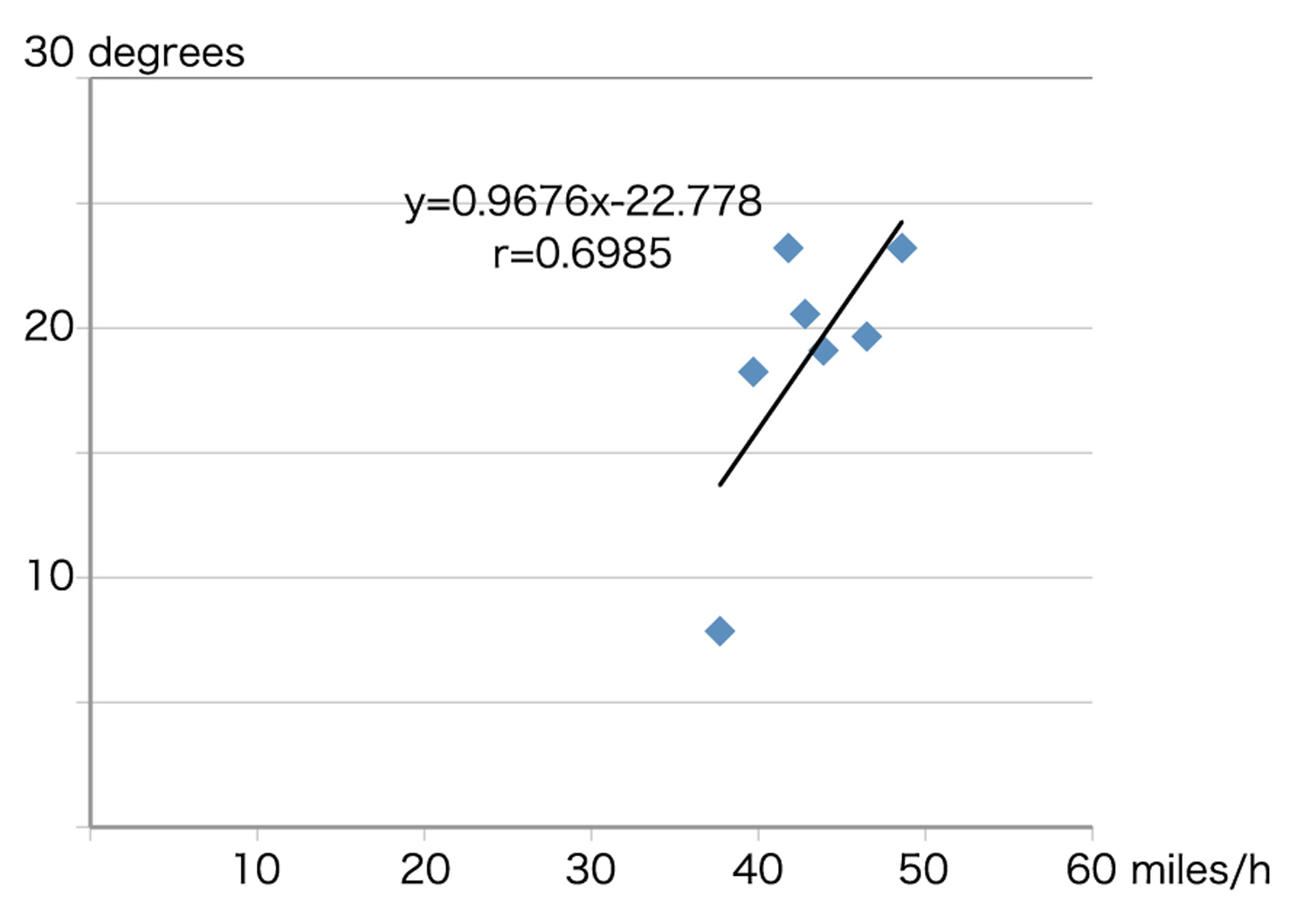
Here are the data of both inclination and the train speed according to the 1966 Official Guide of the Railways. All the fastest passenger trains operated by each railroads using italic font logotypes are listed below.
“Thoroughbred” runs 324.1 miles from Chicago to Louisville in 7 hours 45 minutes; 41.8 miles/h on Monon route. Angle of inclination of Monon logotype is 23.2 degrees.
“Hamming Bird” runs 927 miles from Cincinnati to New Orleans in 23 hours 20 minutes; 39.7 miles/h on L&N route. Angle of inclination of L&N logotype is 18.24 degrees.
“California Zephyr” runs 570 miles from Denver to Salt Lake City in 13 hours 20 minutes; 42.8 miles/h on D&RGW route. Angle of inclination of D&RGW logotype is 20.56 degrees.
“Hamming Bird” runs 287.2 miles from Chicago to Evansville in 6 hours 10 minutes; 46.5 miles/h on C&EI route. Angle of inclination of C&EI logotype is 19.65 degrees.
“Streamliner 400” runs 202.7 miles from Chicago to Green Bay in 4 hours 37 minutes; 43.9 miles/h on C&NW route. Angle of inclination of C&NW logotype is 19.09 degrees.
“Morning Hiawatha” runs 421 miles from Chicago to Minneapolis in 8 hours 40 minutes; 48.6 miles/h on MILW route. Angle of inclination of MILW logotype is 23.2 degrees.
“Winnipeger” runs 398.9 miles from St. Paul to Noyes in 10 hours 35 minutes; 37.7 miles/h on SOO route. Angle of inclination of SOO logotype is 7.85 degrees.
The correlation coefficient of the speed and inclination shown above is +0.69. That means there is some relation between them: contrary to my supposition. Therefore, the relation was generated between the introducing of italic font logotypes by the railroads and the year 1966 when the guide was published.
my previous essay;
http://riogrande.blog.so-net.ne.jp/2011-12-13-1
: scatter diagram of speed and the angle of inclination
以前、「斜体を用いるロゴタイプを導入する鉄道の列車の方が、正体を用いるロゴタイプを導入する鉄道の列車より遅いといえる」という考察を記した。では、斜体を用いるロゴタイプを導入する鉄道における斜体の傾斜角および列車の速度の間には、何か関係があるだろうか。
以前の考察では、斜体の傾斜角にはスピード感という意味は表されてない、と記した。そうであるなら、斜体を用いるロゴタイプを導入する鉄道における、斜体の傾斜角および列車の速度の間に何も関係はないはずだ。
そこで、斜体を用いるロゴタイプを導入する鉄道における斜体の傾斜角および列車の速度について、前回と同じく散布図を用い考察してみた。その結果、今回は両者の間に比例関係があることが分かった。つまり、傾斜角が大きいほど旅客列車の表定速度も高いといえるのである。したがって、資料に用いた時刻表の発行時(1966)、少なくとも斜体の消費者である鉄道会社(および乗客)は斜体におけるスピード感に気付いていたといえるだろう。
2013-07-05 09:00
コメント(3)
arx_Ph.D. さん

Here represented are my model railroad enthusiasm generated from the photos I took during my childhood at Knoxville, Tennessee, or from the photos I took during my recent trips.
I'm a retired professor of design, meanwhile a part-time associate at the architectural design office in Osaka, Japan where I live with my wife.


スピード・レターについての考察、だいぶ深まっていますね。
私は英米人の感覚が理解できず、種々疑問だったことがあります。例えば文字は横書きで左→右に書くのに、機関車の先頭を右とするとか。また、リオグランデ蒸機の左サイドでは、わざわざ鉄道名を前傾させているとか。
で、貴説を参考にさせていただいて、ひとつ、珍説をでっち上げてみました。アメリカ型鉄道模型大辞典↓の「スピード・レター」の項です。御笑覧ください。
by ワークスK (2013-07-10 12:10)
日本でもトラックやバスの横腹に右→左書きされたアルファベットのロゴを見かけます。「先頭から横書き」した結果でしょうけど、違和感があります。そんな、違和感を承知でそれでもひとに「先頭から」書かせる、気持ち・感覚に興味を覚えます。
「機関車」とは蒸機の図面を言われているのでしょうか。わたしは機関士席側を描くのでそうなるのだと思ってました。でも、ディーゼル機になると左先頭の図面が多いですね。確かに不思議です…
by arx_ph.D. (2013-07-10 13:40)
トラックとバスも興味深いですね。鉄道でいったらタンタンです。
それでは! ということで、早速、国道沿いで撮影してみました。
それと、古いものを引っ張り出してみました。
↓掲示板にアップしてみました。
アメリカはどうなんでしょうね。
by ワークスK (2013-07-11 10:08)