Speed Lettering 20 – Peak of Italic Font and Logotype Production [Column_Letters & Figures]
 : Memphis, TN, summer, 1971
Let’s get back to the subject. The question was that when the relation between speed and italic font was noticed.
I used two books, “ENCYCLOPAEDIA OF TYPE FACES”, and “The Elements of Typographic Style” for my survey. The fact extracted from these books is that ’00s, ’20s and ’50s were the quantitative peak of italic font production.
There are 30 transportation companies including airlines and buses using italic font logos in 1966 Official Guide of the Railways. According to my survey, 1890s, ‘20s and ‘60s were the quantitative peak of italic font logotype production among transportation companies.
I drew a line graph representing both the change of italic font production and italic font logotype production. According to the graph, the two lines seem to correlate. But the italic font logotype production reached its first peak in the 1890s, a decade before the italic font production. Also is that both reached their second peak in the ’20s. And italic font production reached its third peak in the ’50s, a decade before the peak of italic font logotype production.
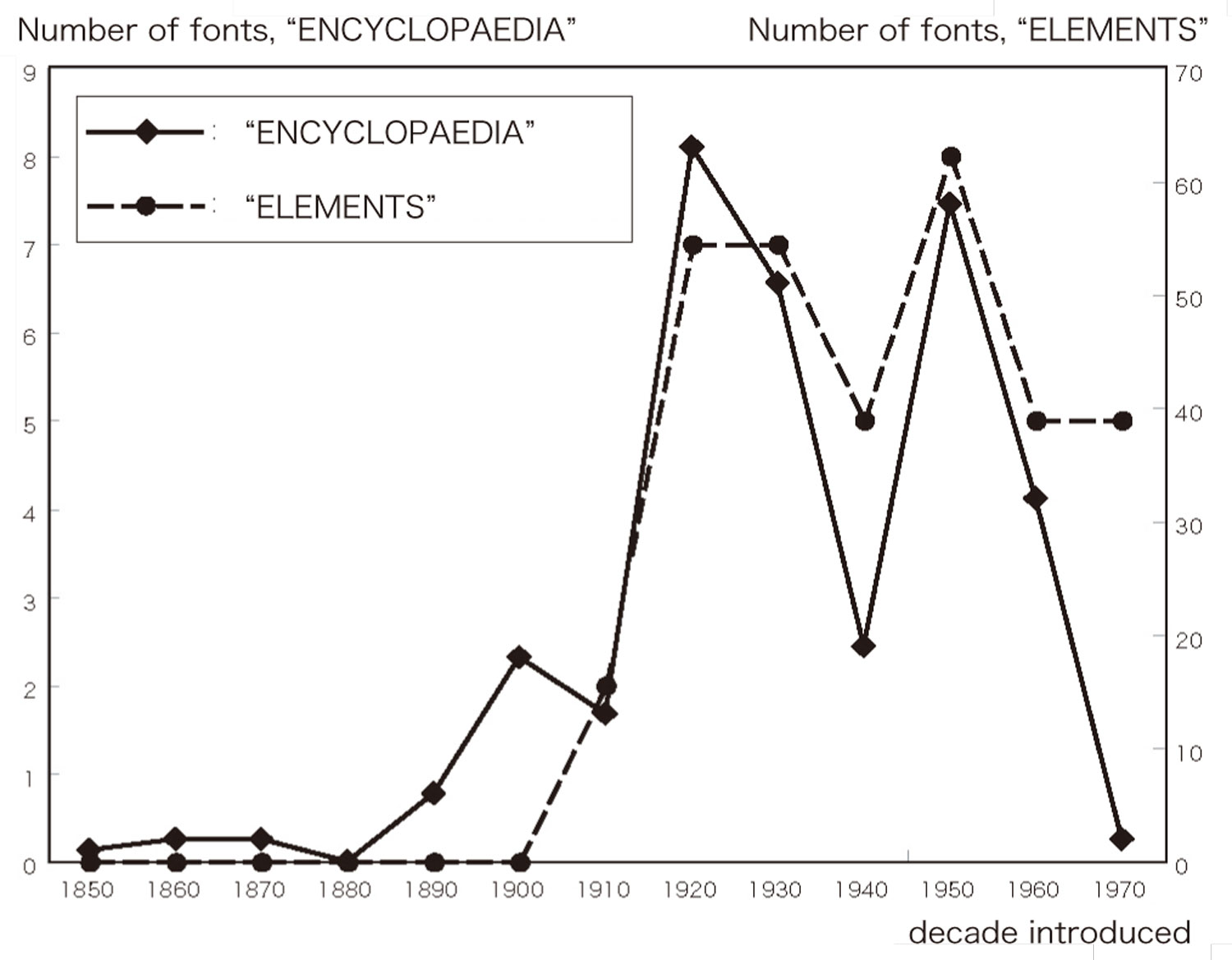
: line graph representing the change of italic font production

: line graph representing the change of italic font logotype production
These facts remind us the story I told before: the italic fonts’ meaning of speed was not noticed when transportation companies adopted them to their logotypes in the 1890s. The basis is that the italic font supply was still inactive in the 1890s.
By the '20s, the consumer noticed the relation between speed and italic font. The basis is that the italic font supply grew active in the '20s. I think that the growth of demand caused the growth of supply. Therefore, italic font logotypes introduced since the ’20s maybe referred to as “Speed Letterings”.
Finally, the relation was noticed by the producer in the ’50s. Mass supplied italic fonts afforded them use for logotypes in the '60s by transportation (and other) companies.
Additional interesting fact is that there seems a relation between italic font logotype production and the economy: severe recession in the next decade to the peak of italic font logotype production. Or, should I say that DJIA slumps in a decade?
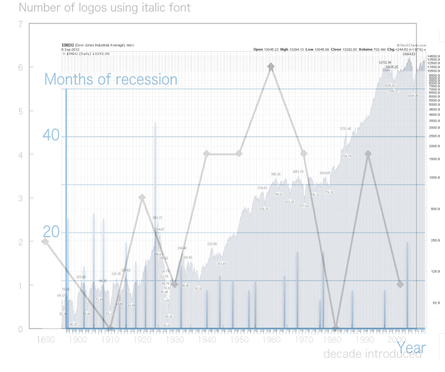
: change of DJIA, months of recession and italic font logotype production
今回の考察のテーマは、いつ頃から斜体におけるスピード感が認識されたのか、という問いである。
先の考察では、デザイナー(斜体の生産者)は斜体のもつスピード感というイメージについて知らないふりをしており、鉄道会社(斜体の消費者)はそれに気付いていたことが分かった。つまり、このイメージの認識については、生産者より消費者の方が先行していた。どこかで追いついたからこそ、こんにち斜体にスピード感というイメージが謳われるのだ。
生産量および消費量の推移を比較することで、どこで追いついたか、すなわちいつ頃から斜体にスピード感というイメージが備わったのか分かると考えた。そこで、先に示したフォントデザインの事典を用い斜体の生産量の推移を調べた。その結果、生産のピークが1900年代、1920年代そして1950年代にあることが分かった。
消費量については、時刻表に載っている運輸業者について、斜体を用いたロゴタイプの導入件数の推移を調べた。その結果、消費のピークが1890年代、1920年代、1960年代そして1990年代にあることが分かった。
これらの結果から、1890年代には認識されていない斜体におけるスピード感について、これが1920年代に消費者側において認識されたと考えることができる。認識したからこそ、多くの運輸業者が斜体を用いたのだ。そして、1950年代にようやく生産者側においても認識され、多くの斜体が供給された結果、1960年代に斜体を用いたロゴタイプが多く制作されたと考えられる。したがって、斜体におけるスピード感が認識されたのは1920年代だといえる。
ちなみに、株価(DJIA)の推移、不景気の長さおよび斜体を用いたロゴタイプの導入件数という3件の推移を重ねてみると、斜体を用いたロゴタイプの導入件数がピークを成す年代の次年代には、深刻な不景気があることが分かる。もっとも、10年に一度は株が暴落すると見た方が正しいかもしれないが…。
2013-07-12 09:00
コメント(0)
arx_Ph.D. さん

Here represented are my model railroad enthusiasm generated from the photos I took during my childhood at Knoxville, Tennessee, or from the photos I took during my recent trips.
I'm a retired professor of design, meanwhile a part-time associate at the architectural design office in Osaka, Japan where I live with my wife.


コメント 0