Speed Lettering 21 – Sense of Speed caused by Effect Lines [Column_Letters & Figures]
 : one of MANGA effect lines
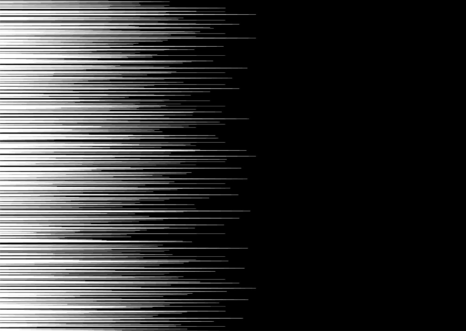 : one of MANGA speed lines
Psychology tells us that “wedge shape”, “oblique position” and “shadows or blur” bring the image of speed or move to us. We may think that logotypes using italics create the image of speed because they have “wedge shape” and/or “oblique position”
Then, are there any logotypes using the effect of “shadows or blur”?
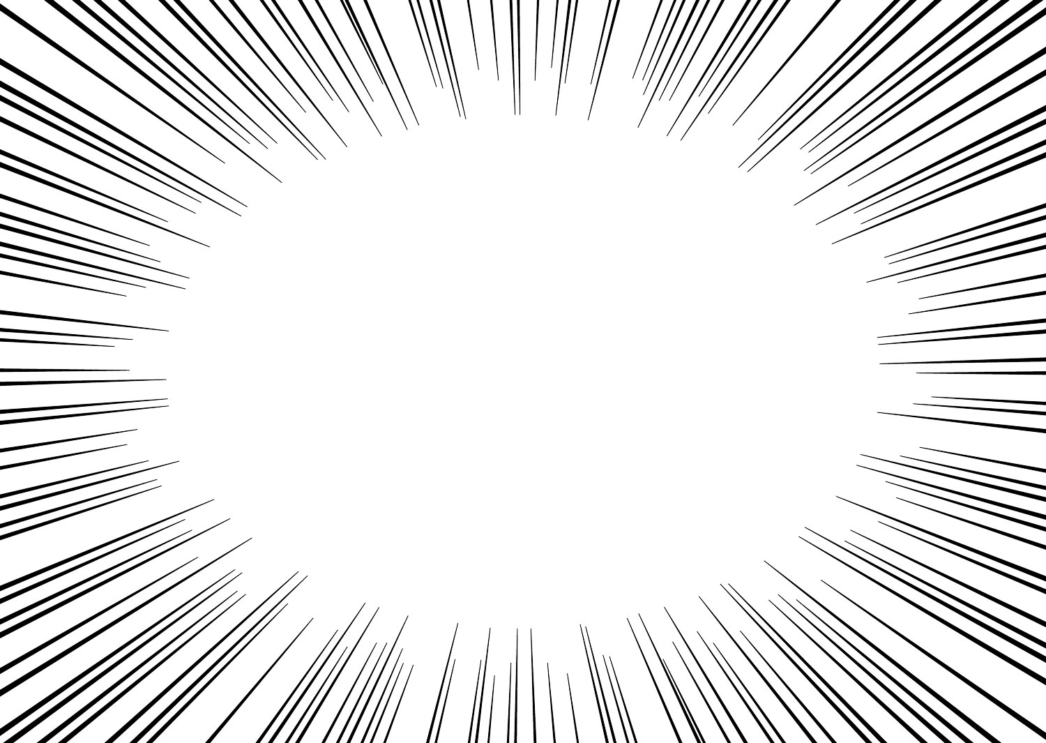
“Shadows or blur”, or I may say gradation, can be represented by a troop of lines. Japanese MANGA uses such lines, called “effect lines”, to represent many aspects in their frames.
One of these MANGA effect lines is called “speed lines”. It is the unwritten law that the MANGA speed lines represent the move or speed. The characteristics of this MANGA speed lines are that the lines are parallel and have random ends.
Considering the direction of speed or move of trains, the parallel lines for railway equipment should be horizontal. Thus, I may say that the “shadows or blur”, which bring the image of speed or move, for the railroad industry is a troop of horizontal lines with random ends.
Here are the examples (see below):
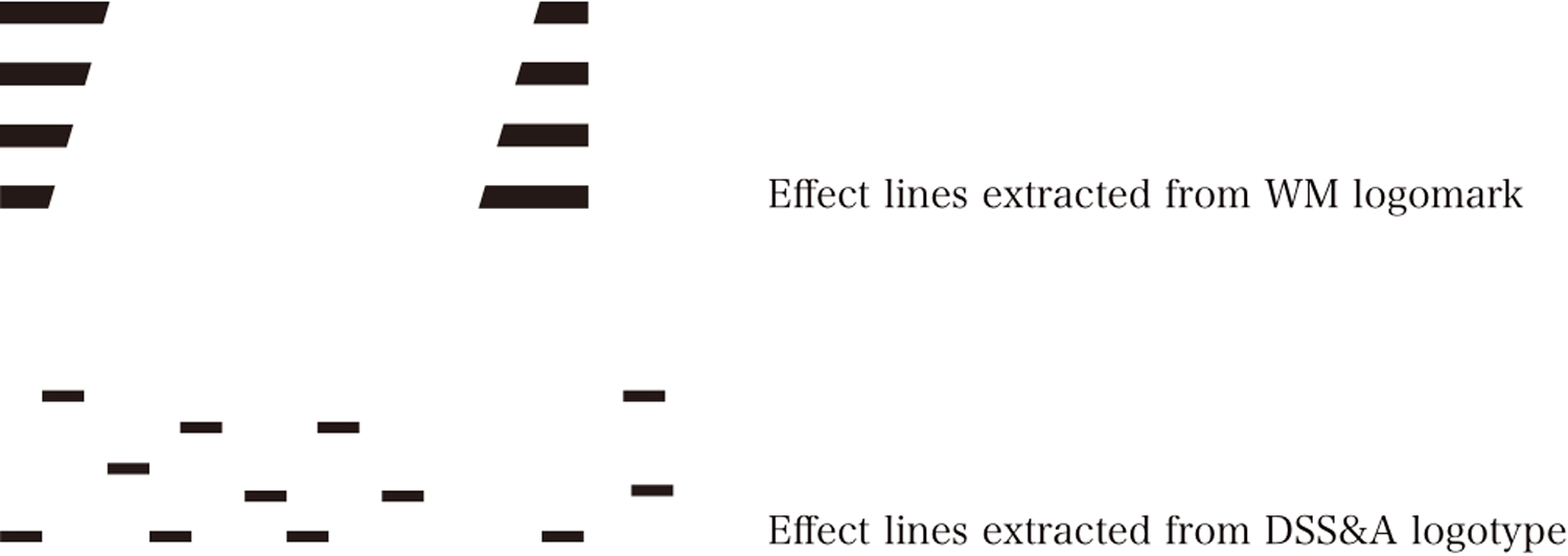
Logomark of Western Maryland Railway has a troop of horizontal lines with random ends. Italic fonts used for the WM logotype cuts the ends of parallel lines randomly.
Short lines with a negative-positive expression on Duluth, South Shore and Atlantic Railway logotype are also considered as a troop of horizontal lines with random ends.
My column on psychological effects;
http://riogrande.blog.so-net.ne.jp/2011-06-30
: example of a troop of horizontal lines with random ends
心理学では、見る者に運動感をもたらす様態として、「尖った形(くさび型の形体)」、「斜めの方向、位置」、そして「表面の陰影やぼやけ」を挙げる。これまでに扱ってきた、斜体を用いたロゴタイプは、「くさび型の形体」および「斜めの方向」による効果を頼るものといえるだろう。
では、「表面の陰影やぼやけ」による効果に頼るロゴタイプはないだろうか。
「表面の陰影やぼやけ」はグラデーションと言い換えることができる。グラデーションは、線描で表わすことができる。この線表現を用いるのが、漫画の背景における「効果線」と呼ばれる技法である。効果線の中でも、動き・スピード感を表現する線描を「流線(スピード線)」や「動線」と呼ぶ。つまり、漫画における流線は、「表面の陰影やぼやけ」による効果に頼る技法だといえる。
漫画における流線の特徴は平行線であること、および、先端が描かれる場合それが不揃いであることである。これと同じ特徴をもつグラフィックに、Western Maryland Railwayのロゴマークにおいて、ロゴタイプの左右に施される線群がある。ロゴタイプが斜体であるため、平行線群の先端が斜めに切れている。つまり、平行線群の先端が不揃いになっている。
鉄道車両における動き・スピード感とは、水平方向のそれだろう。したがって、鉄道車両におけるスピード感をもたらす流線とは、先端が不揃いな水平線群といえるだろう。スピード感をもたらす流線を、先端が不揃いな水平線群と括るなら、Duluth, South Shore and Atlantic Railwayの貨車に記されるDSSAのロゴタイプにある意匠は、その例として挙げられるだろう。ロゴタイプのところどころに短い水平線がちりばめられている。
2013-08-09 09:00
コメント(0)
arx_Ph.D. さん

Here represented are my model railroad enthusiasm generated from the photos I took during my childhood at Knoxville, Tennessee, or from the photos I took during my recent trips.
I'm a retired professor of design, meanwhile a part-time associate at the architectural design office in Osaka, Japan where I live with my wife.


コメント 0