Flying, 01 - The 1939 "Flying" Logo [Column_Letters & Figures]
The logo design of Rio Grande is one of the elements that brought me devoted to Rio Grande.
We can read the details of this logo design in volume 2, number 1 of THE PROSPECTOR. Herbert S. Edwards writes in his article "D&RGW Heralds and Slogans" that this logo was developed through the competition held in 1939.
The italic type font with the extended serif of "R", "G" and "d" creates the image of motion directed toward the right. This image works right if the logo is applied on the engineer's side of the locomotive tender. By then, what would you do with the fireman's side? We can find trucks and vans on highways lettered inside out. But Rio Grande created the leaning to the left "fireman's side version". I'm pleased with the delicacy of Rio Grande.
The logo above is not the original. After tracing the original logo, I made it a little slim to prepare against the blotting of decal paper.
revised, Jun. 11, 2018
Flying, 02 - The 1958 JNR Logo [Column_Letters & Figures]
I don't know whether Japanese National Railways knew the "Flying" Rio Grande logo. The JNR logo was introduced in 1958 for the 151 series M.U. electric car. This JNR logo design creates the image of motion directed toward both ways. I think it suits M.U. electric cars and DMU's running both ways.
revised, Jun. 11, 2018
revised, Sep. 10, 2018
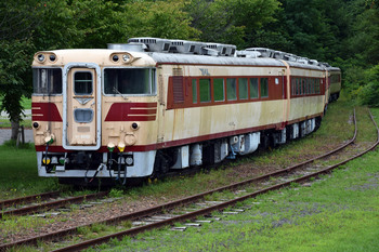 :JNR 82 series DMU. Aug. 26, 2018
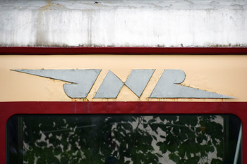 :JNR 82 series DMU. Aug. 26, 2018
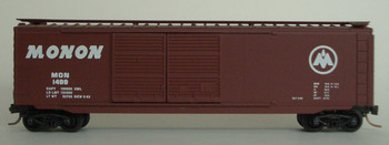
Flying, 03 - The 1937 Monon Logo [Column_Letters & Figures]
Flying, 04 - The 1953 WM Logo [Column_Letters & Figures]
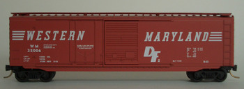 : MTL-33070, WM#35006
We can find another italic type font made logo: WESTERN MARYLAND RAILWAY famous for it's fireball herald. WM added Serifs independent from the letters on freight cars. The serifs expanded to both ends make the logo square, not leaned. This design has both the image of motion and the bi-directional image.
revised, Jun. 11, 2018
Flying, 05 - MILW, SCL, and CNW Logos [Column_Letters & Figures]
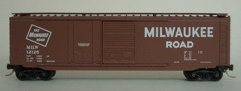 : MTL-33100, MILW#12125
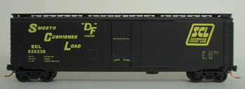 : MTL-3200120, SCL#635336
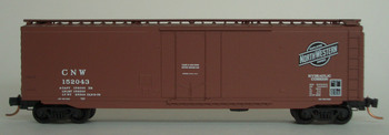 : MTL-32230, CNW#152043
We know many heralds including italic type fonts. Here I represent some of the examples from my collection.
If you focus attention on the string of letters, you can find that all the letters are hemmed in a box, rectangle or parallelogram. The hemmed letters are represented as a symmetrical or point- symmetrical diagram. These diagrams do not inquire the direction. So the "fireman's side version" was unnecessary.
revised, Jun. 11, 2018
Flying, 06 - The 1966 "Stacked" Logo [Column_Letters & Figures]
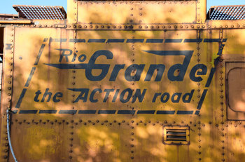 : D&RGW #01457
Rio Grande also had the hemmed version. The stacked logo and the "ACTION road" slogan is hemmed in a parallelogram here on this caboose. The flying logo was treated alike in the herald. But never as a logo. I think it's because of the origin.
The original flying logo was designed by Miss M. Laura Branmkamp, an employee in the Purchasing Department. I think that the amateur designed logo without the supposition of bi-directional use nor deployment made difficulties in deploying the design. Thus the original flying logo lived (and also loved) long.
revised, Jun. 11, 2018
Speed Lettering 01 [Column_Letters & Figures]
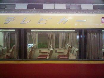 : "Speed Lettering" appeared on Keihan Electric Railway, Japan
The logos designed using the italic fonts are called "Speed Lettering". The flying Rio Grande logo is the one of them using it. But the italic font didn't have the sense of speed at its origin in 14th century.
The italic font was introduced as to stuff more letters in a line. It was introduced to print mini-sized cheaper books.
The italic font had no relations with the speedy "streamline", too. Zephyr had Art-Deco style font, while Hiawatha had handwriting style font.
Speed Lettering 02 [Column_Letters & Figures]
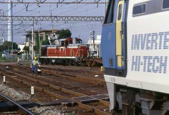 : "Speed Lettering" appeared on Japan Freight Railway, Japan
Well then, when the italic fonts gained the image of speed?
Rio Grande introduced the flying logo in 1939. According to the Micro-scale web page, WM introduced its speed lettering in 1953(-1970), followed by L&N in 1963(-1980), SCL in 1967(-1980), RI in 1970(-1980).
Rio Grande had hard times struggling with more flat UP and Santa Fe at that time. Railroad industry was fighting with more fast and or convenient highways and airliners since 50s. So, it is extracted that the speed lettering was ironically introduced to the railroad industry after when it lost its advantage in speed.
Micro-scale HP;
http://www.microscale.com/
Speed Lettering 03 [Column_Letters & Figures]
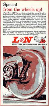 : L&N ad appeared in Sep. 1964 issue of Trains
Today, logos using italic fonts have a sense of speed, represented by its name "Speed Lettering" or "Flying".
Speed has a direction. So, the speed lettering would have a direction, either to the right or to the left.
The flying Rio Grande has a direction to the right, as I mentioned before. In this case, the letters leans forward. In other case, like JFR locomotive in Japan, the letters leans backward.
Here, we can find that the speed lettering can obtain both directions.
Direction of the Rio Grande logo;
http://riogrande.blog.so-net.ne.jp/2010-02-12
Speed lettering on JFR loco;
http://riogrande.blog.so-net.ne.jp/2010-05-08-1
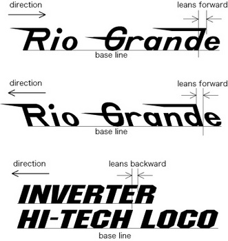 : relations between the direction of train and the letters
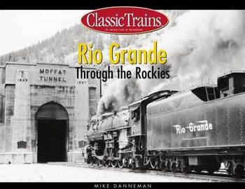 : forward leaning Rio Grande logo appeared on the cover of the book "Rio Grande Through the Rockies" by Mike Danneman, Kalmbach Books, 2002
Speed Lettering 04 [Column_Letters & Figures]
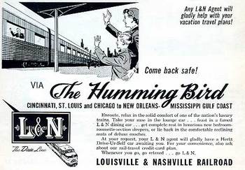 : L&N ad appeared in Jun 1958 issue of Trains
A row of letters sits on the base line. So, the forward-leaned letters precede the base, while the backward- leaned letters are behind the base. If the base moves with the train, the forward-leaned letters precede its train, and the backward- leaned letters are behind its train.
Man perceives the letters with eyes or fingers. The speed of man's perceiving the letters would be almost the same. So, we can say that the letters have almost the same speed. This hypothesis leads to the conclusion that the train with the forward-leaned letters is slower, and that the train with the backward- leaned letters is faster than the letters.
Speed Lettering 05 [Column_Letters & Figures]
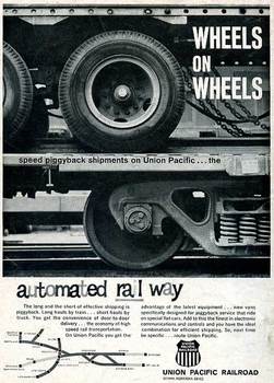 : UP ad appeared in Jul 1965 issue of Trains
Indeed, the Rio Grande was inferior in speed to UP or ATSF. So, we can say that the flying (leaning forward) logo was suitable because of its lack of speed.
Anyhow, the speed of italic fonts and the speed of the train donユt fit. This phenomenon can be grasped as the existence of the difference between the label and the contents. The difference may be the reason why the "Speed Lettering" lived relatively short.
I didn't mention here about the conflict between the direction of writing/reading and the move. "Rio Grande" would appear as "ednarG oiR". Thus there are difficulties in designing the letters on the sides of railroad equipment.
The "Speed Lettering" lived relatively short except the Rio Grande. Now, I wonder how long the BNSF and NS logos will live.
Vague Memories and Misunderstandings [Column_Letters & Figures]
 : vague image
I recently learned the correct pronunciation of Athearn at the blog "Giants of the West". The pronunciation of name is difficult for me, the Japanese. I learned the pronunciation of Salida or Minturn from the narration of DVDs. Well then, how about the BLMA? Per Diem? They may still misunderstood.
When my father asked "vanilla ice cream" for the dessert, the waitress replied "We have no Banana ice cream". That's the other question.
In the vague image above, I can read the number 932. But, I couldn't find in the roster on the web. What is this locomotive…?
Blog "Giants of the West";
http://blog.livedoor.jp/dda40x/archives/51423714.html
Speed Lettering 06 – italics and image of speed [Column_Letters & Figures]
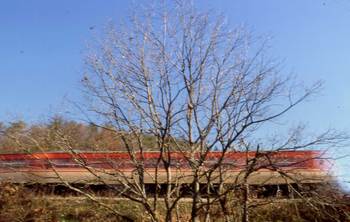 : image of speed
Here, again concerning about “speed lettering”.
I wrote before that the italic fonts were developed to save expensive parchments. Number of letters in a line increases by using the italic fonts. Thus, the italic fonts didn’t have the meaning or image of speed at their origin.
A speed lettered car does move, but the letter itself doesn’t move or run. The image of speed is just only an image, likely to say appearances.
My interest is in that why we cherish the image of speed to the logo using italic fonts today.
The other is that when italic fonts acquired such an image.
Also, is that why italic fonts were coming to use in railroad heralds and how is/was the deed.
The first maybe a matter of psychology, while the second maybe a matter of history. And the third maybe extracted by our hobby!
Belief story about history of italic fonts;
http://riogrande.blog.so-net.ne.jp/2010-05-03-1
Speed Lettering 07 - psychological explanations [Column_Letters & Figures]
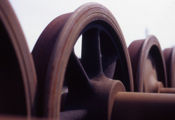 : How about spoke wheel?
Psychology explains the terms for the rise of such appearances;
1) A wedge-shaped objects
2) Oblique directions or positions
3) Shadows or gradations
An instance for 1) A wedge-shaped objects would be “streamlined” equipment.
Vanderbilt tenders and “speed lettering” would be an instance for 2) Oblique directions or positions.
Today’s color scheme of New Jersey Transit’s equipment would be an instance for 3) Shadows or gradations. How about the spoke wheel resembles the effect used in MANGA? Or, how about the steam and smoke of steam locomotives painted by the impressionists? I think these can be also classified as gradations.
The issue is that we cannot catch such an appearance objectively. We can’t scientifically extract the fact. Thus, the psychological explanations are built on hypothesis. It reminds me of the “terror tip”
Well, let’s have a talk quoting this explanation.
Speed Lettering 08 – streamlined form [Column_Letters & Figures]
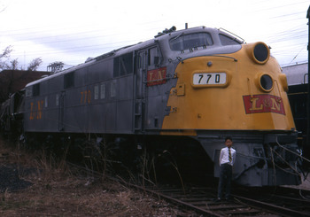 : Louisville, KY. Spring, 1971
Some streamlined forms came from aerodynamics. Some streamlined forms came from elegance. The origin and thus the definition of the streamlined forms are complicated.
The general understanding for the streamlined railway equipment is that it works a little but does not pay (besides today’s high-speed trains). Thus it’s ineffectual and deceptive.
We know that commercial airlines were established in the ‘20s. But the streamlined express trains did run faster than local trains and freight trains. Why the image of deceptive appearance was born? I think that the image was generated by itself.
This is how I think. Psychology explains that the wedge-shaped objects bring the image of speed. But this image was brought to the passengers by the form of a streamlined train tied down at the station track before it showed its performance. The effect brought by the form was so effective that the real performance couldn’t catch up with it. Thus the image of deceptive appearance was born.
Here I represent my definition of the streamlined form; the form wedged and ineffectual.
If so, the streamlined form should have wedges. The streamlined equipment should have edges somewhere on the nose.
Looking from the side, all the EMD’s E series locomotives have slant form. But only E3A to E6A have edges on their nose. Thus I tentatively say that E3A to E6A is the real streamlined equipment.
See the edge on the nose of L&N 770, an EMD E6A found at its namesake city, Louisville?
Speed Lettering 09 - oblique directions or positions [Column_Letters & Figures]
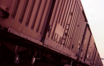 : a kind of oblique angle made by string of Japanese boxcars
Image of speed created by “Speed Lettering” seems to be the effect of the appearance caused by oblique directions or positions. But it is said that we cannot explain the mechanism of the effect on the outer layer.
The first step for the design of italic or oblique fonts would be fixing the angle of inclination. So the angle would be an important element in designing the italic fonts.
Transporting or informing speed grew year by year. Thus, we can imagine that the demand for the effect of the appearance caused by italic font is also increased.
If the effect of the appearance caused by italic font is proportional to the angle of inclination, we also can imagine that the angle should also grow year by year.
I examined the angle in a book “The Elements of Typographic Style ver.3.2” written by Robert Bringhurst in 2008. Robert introduces about 90 italic fonts in this book, which he thought to be representative. The average angle of the italic fonts is 10.6 degrees. Maximum angle is 24.9 degrees, minimum angle: 1.5 degrees. But there are no relationship between the angle and the year the font designed.
This result can be understood that;
1) there is no relationship between the effect of the appearance in oblique and the time series, or,
2) the effect of the appearance in oblique doesn’t change in the time series, or,
3) we cannot represent the change of the effect by figures.
Psychology taught us that there is an effect.
If the effect of the appearance caused by oblique direction is definite, it is hard to explain why there are italic fonts with so many kinds of angles.
Here, we can confirm that we cannot grasp the mechanism of the effect on the outer layer.
2011-07-29 19:49
コメント(0)
Speed Lettering 10 - Art Deco and the 50's [Column_Letters & Figures]
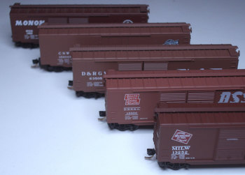 : boxcars decorated with italic fonts produced by MTL
In the book “The Elements of Typographic Style ver.3.2” (2008、Robert Bringhurst), Robert introduces about 90 italic fonts.
I drew a graph representing the age when these fonts were produced. According to the graph, there are 3 peaks: 20's and 30's, 50's and 80's and after. The '20s and '30s are the Art Deco period. The '50s is the “fifties” period. Both the peaks represent the period when American design swept over the world. Thus, we can say that the demand for the italic fonts was increased in those ages.
As there is a relationship between American design and Italic fonts, let’s look into the history of italic fonts used in the railroad logo.
The year class 1 railroads adopted italic fonts to their logos are:
In 1891, Chicago and North Western Transportation Company*1
In 1895, Great Northern Railway*2
In 1905, Duluth, South Shore and Atlantic Railway*3
At least in 1922, Chicago, Milwaukee, St. Paul and Pacific Railroad*4
At least in 1925 (maybe in the 19c), Minneapolis, St. Paul & Sault Ste. Marie Railway (Soo Line) *5
At least in 1928, Chicago and Illinois Midland Railway*6
At least in 1940, Chicago & Eastern Illinois Railroad*7
In 1940, Denver and Rio Grande Western Railroad*8
In 1946, Monon Railroad*9
In 1952, Western Maryland Railroad*10
and so on
Here we can find that the comparatively many “speed lettering” was introduced before/in the Art Deco period.
Reference:
*1 http://www.cnwhs.org/ch_cnw.htm
*2 http://www.greatnorthernempire.net/index2.htm?GNEGNTimeline.htm
*3 http://dssa.habitant.org/logos.htm
*4 according to the system map printed in 1922
http://www.periodpaper.com/index.php/art-type/map/1922-map-chicago-milwaukee-st-paul-railway-train-routes
*5 according to the timetable printed in 1925
http://www.collectionscanada.gc.ca/comics/027002-150.1-e.php?uidc=CollectionCd&sk=111&&&&&&&&&&&&PHPSESSID=8vn90p3vqbokdm02darausd6f0
*6 according to the timetable printed in 1928
http://www.hydroponicsonline.com/store/1928-CHICAGO-ILLINOIS-MIDLAND-RAILWAY-SCHEDULE-BOOK-NR_220793129829.html
*7 according to the timetable printed in 1940
http://www.r2parks.net/c&ei.html
*8 The Prospector, vol.2, No.1
*9 http://images.indianahistory.org/cdm4/item_viewer.php?CISOROOT=/V0002&CISOPTR=1719&CISOBOX=1&REC=3
*10 http://www.alphabetroute.com/wm/protopaint.php
2011-08-05 20:35
コメント(0)
Speed Lettering 11- mobiles and airlines [Column_Letters & Figures]
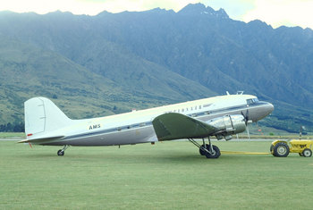 : Queenstown, New Zealand Jan. 4, 1994.
 Comparatively many railroads adopted italic fonts to their logos in the Art Deco period.
Art Deco period was the period when mass production and mass consumption were executed. Mass production requires speed. Thus, it is easy to imagine that citizens required speed to the transportation related industries as many commercial airline carriers were established in this period.
Let’s see how transportation related industries adopted the italic fonts to their logos to find the relationship between the citizen’s demand and the italic fonts.
On the road; General Motors (including GMC, Chevrolet, Buick, Oldsmobile, Pontiac, Cadillac), Chrysler (including Chrysler, Plymouth, Dodge) and Ford Motors (including Ford. Lincoln) don’t adopt the italic fonts to their logos (Ford logo is a script).
Trailways adopted it in 1965. Greyhound adopted it in 2007.
How about major historical commercial airline carriers?
Pan American Airways (established in 1927) adopted the logo using italic font in 1930.
Delta Airlines (established in 1928) adopted the logo using italic font in 1945.
United Airlines (established in 1926) adopted the logo using italic font in 1952.
Trans World Airlines (established in 1925) adopted the Raymond Lowey designed logo using italic font in 1959.
Thus, the railroad industry adopted the italic fonts to their logos, going ahead of other transportation related industries.
Reference:
Web site representing the Trailways logo;
http://www.trademarkia.com/national-trailways-bus-system-72227861.html
Web site representing the history of Greyhound logo design;
http://en.wikipedia.org/wiki/Greyhound_Lines
Web site representing the history of Pan Am logo design;
http://www.panamair.org/History/logos.htm
Web site representing the history of Delta logo design;
http://worldsbestlogos.blogspot.com/2007/11/delta-air-lines-logo.html
Web site representing the history of UA logo design;
http://www.sitepoint.com/save-the-united-airlines-iconic-tulip/
Web site representing the history of TWA logo design;
http://www.flickr.com/groups/twa/
2011-08-12 17:49
コメント(0)
Speed Lettering 12 – railroads and italics [Column_Letters & Figures]
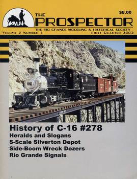 : The Prospector featuring the history of Rio Grande logo
Here is the summary for this discussion.
Italic fonts didn’t have the meaning or the intention of speed or dynamics at their origin. Comparatively many italic fonts were produced in the ‘20s and ‘30s, the Art Deco period. In the United States, italic fonts were adopted by the railroad industry as a logo, going ahead of other transportation related industries. Today, it is said that italic fonts have the meaning of speed.
If we read this summary from the end against the time series, we can find a fact: italic fonts gained the meaning of speed since the railroad industry adopted them to their logos. Is that true?
I know there would be exceptions because I didn’t research all the logos. But the logos of class 1 railroads using italic fonts would play a big part in the italic fonts’ gaining the meaning of speed among the transportation related industries because of their degree of exposure to the citizens of the United States. Now, I may say that the meaning of speed of the italic fonts was generated when railroads began adopting them to their logos.
Wait, how should we treat the psychological explanations? According to the psychological explanation, oblique directions or positions automatically generate the image of speed. Quoting this explanation, italic fonts should have gained the meaning of speed at their origin.
Here, I quote the psychoanalysis to explain this contradiction. According to the psychoanalysis, time series does not exist in our unconscious. This means that the cause would follow the result. Italic fonts’ meaning of speed was gained at their origin, but maybe in our unconscious. Railroad industry dragged it out from our unconscious by adopting them to their logos.
Finally, we can say that the italic fonts’ meaning of speed was recognized when railroad industry adopted them to their logos.
2011-08-19 22:13
コメント(0)
Number 69035 – 01 [Column_Letters & Figures]
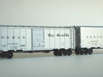 : two Rio Grande AX69035s
The title of this essay looks rather ambiguous, but it only indicates the number of a car.
I’m making a list of my equipment, not to order the same car for my collection. But, here are 2 Rio Grande AX69035s. This is what happened. I reserved INTERMOUNTAIN item number 66018-01 in Oct. 2007. Then, I reserved MTL 2000776 in Apr. 2008 and was arrived in the same month; the first AX69035. The IMR car arrived in Oct. 2008; the second AX69035. The number was not certain when I reserved IMR 66018-01.
According to the roster on Rio Grande Modeling & Historical Society, there were 400 cars for this series. I have no information on how many were assigned to MOW equipment. But I suppose that the car is not the only car. How come both manufacturers chose number AX69035?
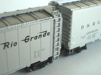 : looking at the difference of detail between IMR and MTL models
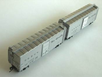 : D&RGW AX69035s
2011-09-22 18:09
コメント(0)
Number 69035 – 02 [Column_Letters & Figures]
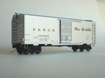 : MTL 2000776, D&RGW AX69035 in “@Minturn Scheme”
 We can find the prototype photo of the exact car in the book “Rio Grande Color Guide to Freight and Passenger Equipment”. There are also photos of the exact car on web. According to the book, the car was assigned as a tool car for the SB-1 side boom Caterpillar outfit AX4851 along with a caboose 01408.
The photo in the book was taken at Minturn in 1975. Photos on the web were taken at Bond in 2001. Both Minturn and Bond are nifty places to visit for the enthusiasts. This brings a supposition that AX69035 is famous among Rio Grande fans.
It seems that the car was moved to Bond after the closure of Rio Grande’s Tennessee Pass route. Looking carefully at both models, we can find “MW” lettering on the left side of the door of the IMR car. This lettering doesn’t appear in the photo taken at Minturn, but appears at Bond. Thus, MTL AX69035 represents its Minturn-age scheme and IMR AX69035 represents its Bond-age scheme. Well, I’ll keep both in my collection.
Photo of AX69035 by HemiAdda2d
http://www.trainboard.com/grapevine/showthread.php?98885-DRGW-MOW-equipment
Photo of AX69035 by bravogjt
http://www.trainboard.com/grapevine/showthread.php?75134-Survivors/page32
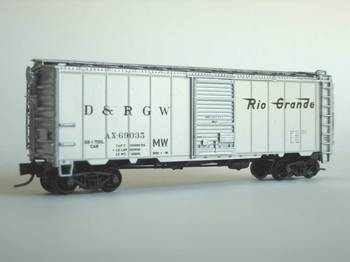 : IMR 66018-01, D&RGW AX69035 in “@Bond scheme”
 2011-09-30 12:59
コメント(0)
Figures, 2 and 4 - 01 [Column_Letters & Figures]
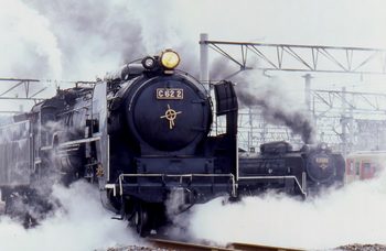 : Umekoji, Kyoto, Japan. Mar 24, 1994. No.2 and 200 in action
I wonder how model manufacturers decide the number of cars they produce.
Here, number means not how many they produce, but the road number they put on their products. I know they put accurate numbers on from the prototype. But it seems they select randomly from the candidacies. Then, aren’t there any “destined” or favored figures?
In Japan, odd numbers are preferred at some occasions. Gratuities should be ¥3000, 5000, and so on. Numbers of teacup set would be 5. 7th inning is told as a lucky inning at Japanese baseball game . Three 7s means a great hit at “pachinko”, a Japanese pinball game. Contrary, number 4 is hated because the pronunciation is the same to the Japanese word meaning death. Number 9 is also hated because the pronunciation is the same to the Japanese word meaning affliction. While, number 8 is loved as the form of the Chinese character widens toward the end: the form reminds us of get more and more prosperous.
I heard that number 4 is appreciated in United States because the pronunciation reminds of fortune.
As this hobby has strong relationship with figures, I came to a thought that there also are some destined (or regarded as lucky) figures in this hobby. Road numbers UP844(4) and SP4449 reinforced the thought.
Twenty 3’-6” gauge steam locomotives are surviving and operational in Japan. The number plate of ex-JNR locomotives is consisted of class and number: C62-2 means number 2 of class C62. If I count the figures used for the number of surviving locomotives, 0, 1 and 2 are the most used figures.
According to the “SteamLocomotive.com” web site, there are 192 3 feet and standard gauge steam locomotives surviving in United States. If I count the figures used for the number, 1, 2 and 4 are highly ranked.
The graph below shows the result of my counting figures: the graph represents the frequency of figures used for the road number of surviving steam locomotives, by percentage, both in Japan and United States.
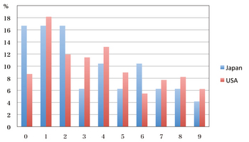 : graph showing the percentage of figures used for the road number of surviving steam locomotives
2012-02-03 12:58
コメント(0)
Figures, 2 and 4 - 02 [Column_Letters & Figures]
 : Christchurch, New Zealand. Jan. 3, 1994. #2693 in action
Here, I’m concerning about destined figures in this hobby.
According to the graph I represented before, some facts can be found.
1) It seems that young numbers are relatively more used in both countries (figure 1 is the most used in both countries. Use of figure 9 is limited in both countries).
2) Even numbers are relatively more used in both countries except figure 6 in United States.
3) The Japanese frequency of figure 0 and 6 is as twice as many of United States’. And the United States’ frequency of figure 3 is as twice as many of Japanese.
Japanese enthusiasts prefer numbers good place to leave off. Top number’s priority would be high in both countries. That would be a good reason for 0 and 1’s frequency.
Figure 6 reminds me of the “number of beast” mentioned in the New Testament, the Book of Revelation. Wouldn’t that be the reason for the limited use in United States?
These concerns leave figure 2 without reason why they are frequently used.
We cannot tell the reason of destinies. That leads me to a phenomenon that the commonly destined (or regarded as lucky) figure for steam locomotives, both in Japan and United States, is figure 2, because of its reasonless.
In United States, I can also add figure 4 as the destined figure, if I ignore “4 as fortune” proverb. How do you think of this?
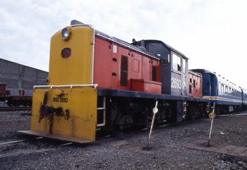 : Christchurch, New Zealand. Jan. 3, 1994.
2012-02-10 19:45
コメント(0)
Speed Lettering 13 – train speed and the logotype [Column_Letters & Figures]
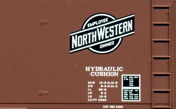 : MTL32230 represents C&NW logotype
As I mentioned before, Italic fonts didn’t have the meaning or intention of speed at their origin; it is said that the original purpose of creating the italic font was to save space/expensive paper in 15c.
Also mentioned before is that I think the meaning of speed of the italic fonts was generated when railroads began adopting them to their logotypes.
As far as I know, the first class 1 railroad who introduced speed lettering herald is Chicago and North Western (and subsidy Chicago, St. Paul, Minneapolis, and Omaha) in 1891. Following is Great Northern in 1895, Duluth, South Shore and Atlantic in 1905.
Here is my question this time; why C&NW and the followers introduced italic fonts for their logotypes?
First, I came to the thought that these pioneers were speed conscious. So I compared the speed of trains using the Sep. 1966 Official Guide of the Railways. I should use Official Guide printed in the 1890s but I don't have any.
I calculated the tabular speeds of famed named trains run by class 1 railroads.
For example, NYC’s train No. 25, the Twenties Century Limited departs New York on 18:00. Running entire 960.7miles, the train arrives Chicago on 10:00 the next day. Therefore the train’s tabular speed is 960.7 miles / 16 hours = 60.04 miles/hour.
Average tabular speed of all the class 1 railroads' named passenger trains (43 trains) is 49.69 miles/h.
Average tabular speed of passenger trains run by class 1 railroads who uses regular font for the logotype (35 trains) is 50.13 miles/h.
Average tabular speed of passenger trains run by class 1 railroads who use italic font for the logotype (8 trains) is 47.76 miles/h.
Contrary to the expectation, the average tabular speed of the trains run by railroads who use italic font for the logotype is slower than those by railroads using the regular font.
Thus, I may say that the railroads using italic font for their logotypes run slower trains than those who use regular font for the logotypes. Therefore, it is difficult to say that speed conscious railroads introduced italic font to their logotypes: we cannot find the relation between speed and italic font when railroads began using italic font for their logotypes.
fore mentioned page concerning speed lettering;
http://riogrande.blog.so-net.ne.jp/2011-08-19
2012-06-15 13:49
コメント(0)
Speed Lettering 14 – space for the logotype [Column_Letters & Figures]
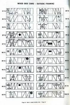 : Page 8 of "Prototype Lettering Diagrams" represents USRA single sheathed boxcar letterings
My question was that why C&NW and the followers introduced the italic font for their logotypes.
At their origin in the 15c, the purpose of the italic font was to save by then expensive papers through downsizing the width of letters. If this purpose still survived, though the price might go down in the 19c when railroads began introducing logos, there would be a representation of the influence of this purpose somewhere in the railroad world.
It can be said that boxcars have relatively large surface among the equipment railroads own. Also, the amounts of boxcars were the most among the equipment railroads own. Therefore, many railroads adopted their names, later logotypes or heralds on them.
I don 't have any information on 19c boxcars. Let me try to think of USRA 40' boxcars.
USRA 40 feet boxcars, for example, had 6 feet width door in the center. That makes 17 feet width of flat surface on each side of the door. Reporting marks were usually designated to the left side. So many railroads adopted their name on the right side of the door. And yet, some roads adopted them on the left or on the door itself.
The sliding door of the USRA 40 feet boxcar opens to the right. If one considers the hiding caused by the opening door, the width of the flat surface for the name will be restricted to 11 feet. Also is the stirrups or ladder to the roof: they were also on the right end. Considering these obstacles, the maxim width for the letterings would be about 10 feet.
Adding to this fact, single sheathed cars had braces: Considering the use of stencils for applying the letters, braces were also the obstacles.
2012-06-22 09:12
コメント(0)
Speed Lettering 15 – number of letters [Column_Letters & Figures]
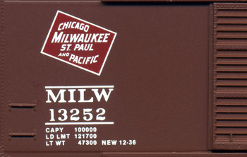 : MTL34140 represents old MILW logotype
My question was that why C&NW and the followers introduced the italic font for their logotypes.
I believe that the pioneers who introduced logotypes using italic font have relatively long names;
C&NW (Chicago and North Western Transportation Company) introduced it in 1891.
CSPM&O (Chicago, St. Paul, Minneapolis and Omaha Railway) also introduced it in 1891.
GN (Great Northern Railway) introduced it in 1895.
DSS&A (Duluth, South Shore and Atlantic Railway) introduced it in 1905, and so on.
The average amount of letters and spaces used to write the full name of all the class 1 railroads listed since 1956 is 29.61.
The average amount of letters and spaces used to write the full name of the 4 pioneers is 39.
The results of the previous discussion were that the maxim width for the letterings on USRA 40' boxcar was about 10 feet. Simply calculating, 39 letters in 10 feet means a little more than 3 inches per letter. Relatively small.
The purpose of applying the owner’s name on equipment would be to strengthen the identity or to advertise the identity of the owner. To achieve the goal, the letters should be readable or prominent. Thus, one needed some idea to apply an owner’s name to the side of the equipment to achieve the goal.
2012-06-29 09:31
コメント(0)
Speed Lettering 16 – designing the letters [Column_Letters & Figures]
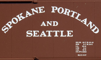 : MTL34210 represents SP&S’ arched and doubled name
My question was that why C&NW and the followers introduced italic font for their logotypes.
I wrote that one needed some methods to apply an owner’s name large enough to strengthen the identity, or to advertise the identity of the owner.
First was to “shorten” the names to apply a large letter (ex RI). The pioneers didn't chose this method.
The second was to “double”, “arch” or “incline” the string of letters to apply a large letter (ex C&NW, NP, SP&S). All pioneers tried the second method; doubled the letters.
The third was to create a logo-mark or a herald instead of the full name to apply a large letter. All pioneers also tried the third. They created logo-marks or heralds: letters enclosed in a figure, many of them in a parallelogram.
Let me inspect how the method of creating heralds worked reducing the number of letters.
The average amount of letters and spaces used in the logotypes or heralds of all the class 1 railroads listed since 1956 is 15.35. Thus, the compression ratio is 50.68%, almost lowered to half.
The average amount of letters and spaces used in the logotypes or heralds of the 4 pioneers is 30. Thus, the compression ratio is 80.16%, only 20% cut. Therefore, there were some difficulties among the pioneers in shortening their names.
Therefore, for all these efforts, it seems that these methods didn't work enough to achieve the goal.
2012-07-06 10:01
コメント(0)
Speed Lettering 17 – Reverse Engineering the Design [Column_Letters & Figures]
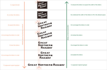 : figure showing the supposed process of logotype design, GN as an instance
My question was that why C&NW and the followers introduced the italic font for their logotypes.
Relatively long names of the railroad made them difficult to apply their names on the side of boxcars.
For all these efforts aforementioned, the space of the side of a boxcar might be too small to achieve the goal.
The considered idea is to go typography: design the letter itself to achieve the goal. Now we can imagine one might have come to an idea of using italic font to apply large letters in a limited space.
Decreasing the width of regular letters seems the easiest way to apply letters in limited space. But, it seems that the readability would also decrease, considering the move of equipment. Italic font indeed has a more narrow width than regular font at its baseline. But, according to its inclined angle, the total width including dimension at the cap-line is almost the same as the regular letter (ex. dimension “A” illustrated above).
Accordingly, using italic font seems to be the way to keep readability regardless of its limited space.
Thus, it may be said that the pioneers’ purpose of introducing italic font was to save space: italic font’s primitive purpose, not to create the image of speed.
I tried reverse engineering the process of logotype-design using old GN logo-mark, the shortest among the pioneers, as an instance. The supposed process reflects the result of the inspection described before.
According to my reverse engineering, I extracted a logotype using the regular letter (bottom, the figure above) from the original logo-mark (top, the figure above). The width of the letter “N” is kept through the process (dimension “A” illustrated above).
Figure below shows the genuine logotype using regular font succeeding the square herald (top, figure below), and the extracted logotype (bottom, figure below). The reverse engineered logotype resembles the genuine logotype, isn’t it?
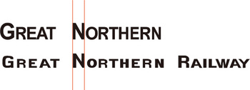 : genuine logotype and extracted logotype
revised, Mar. 5, 2021
2012-07-13 09:39
コメント(0)
Speed Lettering 18 – Historical Inclination of Italic Fonts Production [Column_Letters & Figures]
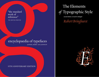 : two books on history of font design
In the previous column, I represented a relation between the train speed and the speed lettering. According to my previous survey, this relation was generated unnoticed. Then, when the relation was noticed? Here I look back the history of italic font to find it out.
I used two books introducing the history of font design. One is the “ENCYCLOPAEDIA OF TYPE FACES” (by Jaspert, W. 1986), and the other is “The Elements of Typographic Style” (by Bringhurst, R. 2008). Each book introduces as many as 276 and 87 italic fonts.
I took the angles of inclination of italic fonts introduced in these books. My supposition is that if the italic fonts’ inclination and speed had some relation, the inclinations might grow large concurrently with the growth of speed.
By the book “ENCYCLOPAEDIA OF TYPE FACES”, the correlation coefficient of the year of production and the inclination was -0.32. By the book “The Elements of Typographic Style”, the correlation coefficient of the year of production and the inclination was -0.10.
The correlation coefficient represents how deep the relation is by figures between -1.0 and +1.0; zero represents the least. Figures -0.32 and -0.10 mean that there is little relation between them. Therefore, I may say that the inclination of italic font doesn’t grow large, or, the inclination is unrelated to the speed.
my previous column on speed lettering;
http://riogrande.blog.so-net.ne.jp/2011-08-19
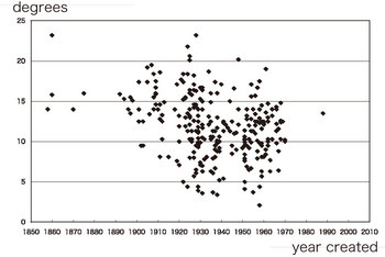
: the correlation in “ENCYCLOPAEDIA OF TYPE FACES”
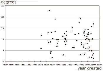
: the correlation in “The Elements of Typographic Style”
2013-06-28 09:00
コメント(0)
Speed Lettering 19 – Speed Lettered Train Speed and Inclination of Speed Lettering [Column_Letters & Figures]
 : taking the angle of speed lettering
In the previous column, I represented a relation between the train speed and the speed lettering. According to my previous survey, average tabular speed of the trains run by railroads using italic font for the logotype is slower than those by railroads using regular font.
Then, how about the relation between italic font logotype’s angle of inclination and the train speed run by the railroad which introduced italic font logotype?
My supposition is that if the italic font has no relation with the speed, there would be also no relation between the train speed and the italic font logotype’s angle of inclination.
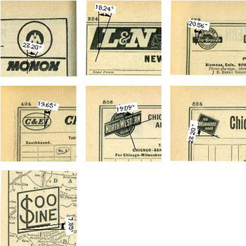
Here are the data of both inclination and the train speed according to the 1966 Official Guide of the Railways. All the fastest passenger trains operated by each railroads using italic font logotypes are listed below.
“Thoroughbred” runs 324.1 miles from Chicago to Louisville in 7 hours 45 minutes; 41.8 miles/h on Monon route. Angle of inclination of Monon logotype is 23.2 degrees.
“Hamming Bird” runs 927 miles from Cincinnati to New Orleans in 23 hours 20 minutes; 39.7 miles/h on L&N route. Angle of inclination of L&N logotype is 18.24 degrees.
“California Zephyr” runs 570 miles from Denver to Salt Lake City in 13 hours 20 minutes; 42.8 miles/h on D&RGW route. Angle of inclination of D&RGW logotype is 20.56 degrees.
“Hamming Bird” runs 287.2 miles from Chicago to Evansville in 6 hours 10 minutes; 46.5 miles/h on C&EI route. Angle of inclination of C&EI logotype is 19.65 degrees.
“Streamliner 400” runs 202.7 miles from Chicago to Green Bay in 4 hours 37 minutes; 43.9 miles/h on C&NW route. Angle of inclination of C&NW logotype is 19.09 degrees.
“Morning Hiawatha” runs 421 miles from Chicago to Minneapolis in 8 hours 40 minutes; 48.6 miles/h on MILW route. Angle of inclination of MILW logotype is 23.2 degrees.
“Winnipeger” runs 398.9 miles from St. Paul to Noyes in 10 hours 35 minutes; 37.7 miles/h on SOO route. Angle of inclination of SOO logotype is 7.85 degrees.
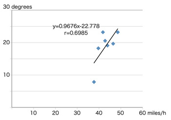
The correlation coefficient of the speed and inclination shown above is +0.69. That means there is some relation between them: contrary to my supposition. Therefore, the relation was generated between the introducing of italic font logotypes by the railroads and the year 1966 when the guide was published.
my previous essay;
http://riogrande.blog.so-net.ne.jp/2011-12-13-1
: scatter diagram of speed and the angle of inclination
2013-07-05 09:00
コメント(3)
