Speed Lettering 20 – Peak of Italic Font and Logotype Production [Column_Letters & Figures]
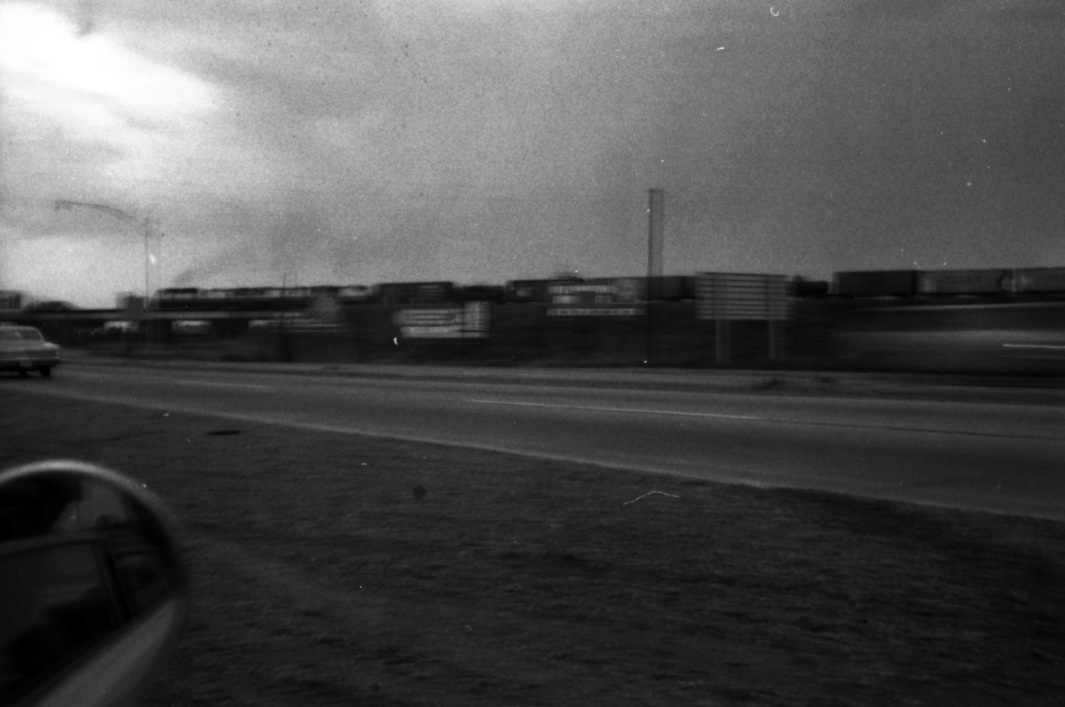 : Memphis, TN, summer, 1971
Let’s get back to the subject. The question was that when the relation between speed and italic font was noticed.
I used two books, “ENCYCLOPAEDIA OF TYPE FACES”, and “The Elements of Typographic Style” for my survey. The fact extracted from these books is that ’00s, ’20s and ’50s were the quantitative peak of italic font production.
There are 30 transportation companies including airlines and buses using italic font logos in 1966 Official Guide of the Railways. According to my survey, 1890s, ‘20s and ‘60s were the quantitative peak of italic font logotype production among transportation companies.
I drew a line graph representing both the change of italic font production and italic font logotype production. According to the graph, the two lines seem to correlate. But the italic font logotype production reached its first peak in the 1890s, a decade before the italic font production. Also is that both reached their second peak in the ’20s. And italic font production reached its third peak in the ’50s, a decade before the peak of italic font logotype production.
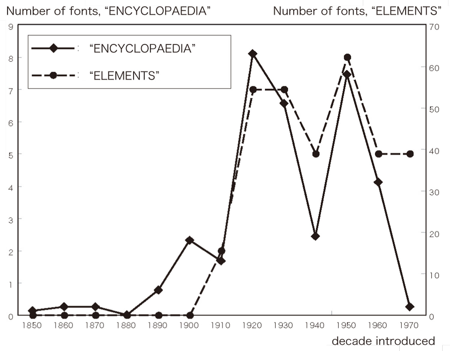
: line graph representing the change of italic font production

: line graph representing the change of italic font logotype production
These facts remind us the story I told before: the italic fonts’ meaning of speed was not noticed when transportation companies adopted them to their logotypes in the 1890s. The basis is that the italic font supply was still inactive in the 1890s.
By the '20s, the consumer noticed the relation between speed and italic font. The basis is that the italic font supply grew active in the '20s. I think that the growth of demand caused the growth of supply. Therefore, italic font logotypes introduced since the ’20s maybe referred to as “Speed Letterings”.
Finally, the relation was noticed by the producer in the ’50s. Mass supplied italic fonts afforded them use for logotypes in the '60s by transportation (and other) companies.
Additional interesting fact is that there seems a relation between italic font logotype production and the economy: severe recession in the next decade to the peak of italic font logotype production. Or, should I say that DJIA slumps in a decade?
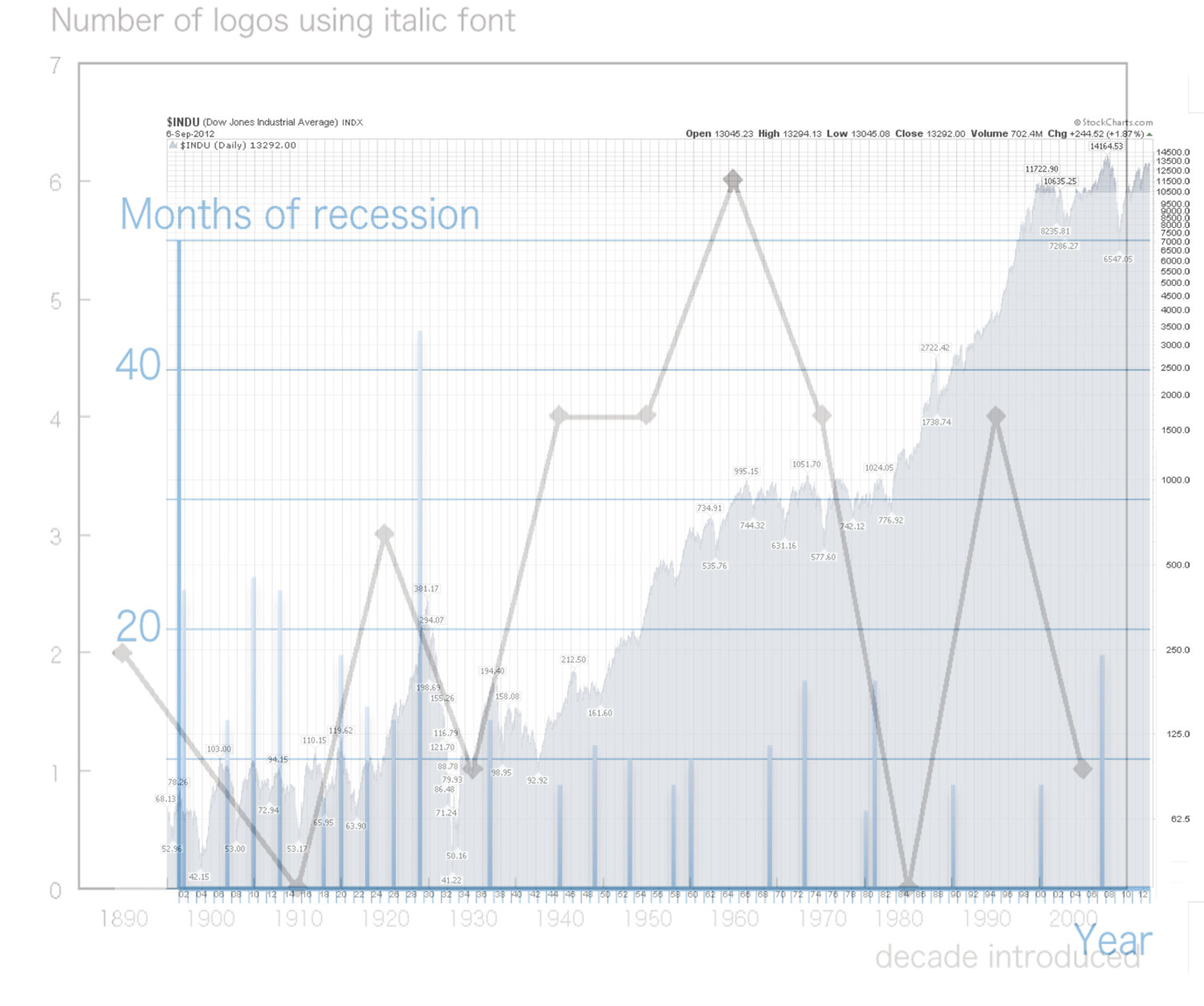
: change of DJIA, months of recession and italic font logotype production
2013-07-12 09:00
コメント(0)
Speed Lettering 21 – Sense of Speed caused by Effect Lines [Column_Letters & Figures]
 : one of MANGA effect lines
 : one of MANGA speed lines
Psychology tells us that “wedge shape”, “oblique position” and “shadows or blur” bring the image of speed or move to us. We may think that logotypes using italics create the image of speed because they have “wedge shape” and/or “oblique position”
Then, are there any logotypes using the effect of “shadows or blur”?
“Shadows or blur”, or I may say gradation, can be represented by a troop of lines. Japanese MANGA uses such lines, called “effect lines”, to represent many aspects in their frames.
One of these MANGA effect lines is called “speed lines”. It is the unwritten law that the MANGA speed lines represent the move or speed. The characteristics of this MANGA speed lines are that the lines are parallel and have random ends.
Considering the direction of speed or move of trains, the parallel lines for railway equipment should be horizontal. Thus, I may say that the “shadows or blur”, which bring the image of speed or move, for the railroad industry is a troop of horizontal lines with random ends.
Here are the examples (see below):
Logomark of Western Maryland Railway has a troop of horizontal lines with random ends. Italic fonts used for the WM logotype cuts the ends of parallel lines randomly.
Short lines with a negative-positive expression on Duluth, South Shore and Atlantic Railway logotype are also considered as a troop of horizontal lines with random ends.
My column on psychological effects;
http://riogrande.blog.so-net.ne.jp/2011-06-30
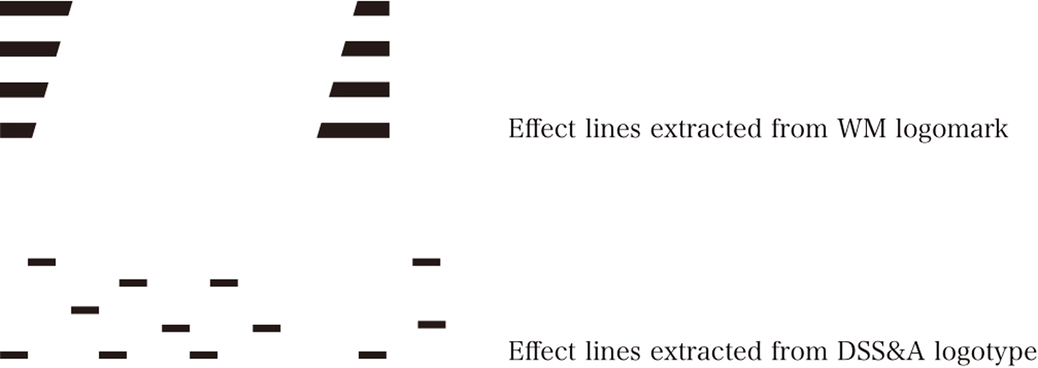
: example of a troop of horizontal lines with random ends
2013-08-09 09:00
コメント(0)
Speed Lettering 22 – Sense of Speed caused by Serifs [Column_Letters & Figures]

In the previous column, I wrote that a troop of horizontal lines with random ends bring the image of speed or move. The short lines on DSS&A logotype were represented as an example.
Works K of “TransPacific Railroad” says that serifs may bring the image of speed. Indeed, serifs of Rio Grande logotype seem to bring the image of speed, and they can be regarded as a troop of horizontal lines with random ends.
But, the serifs are not always horizontal. Capital letters C, E, F, G, L, S, T, and Z have vertical serifs. In addition to this, the arrangement of serifs of regular fonts are apt to line, not in random. So, I may say that horizontal serifs of italic fonts bring the image of speed or move.
As an instance, serifs in italic MONON logotype are all horizontal. But, they lined methodically and are also relatively short as you can see above. They are not so much lines as points.
Serifs in italic L&N logotype are long enough to be recognized as lines. But, they are the mixture of horizontal and vertical lines.
Fortunately, serifs of Rio Grande logotype are all horizontal. Also is that they are relatively long enough to be recognized as lines. And, they have wedge shapes. Accordingly, Rio Grande logotype uses both “wedge shape” and “shadows or blur” effects. I think this is why we call the logotype of Rio Grande as “speed lettering”.
“TransPacific Railroad” web page mentioning “speed lettering” (Japanese only);
http://hpcgi2.nifty.com/kk_works/usdb.cgi?pp=13
2013-08-16 09:00
コメント(0)
Flying, 07 – History of the Term “Rio Grande” [Column_Letters & Figures]
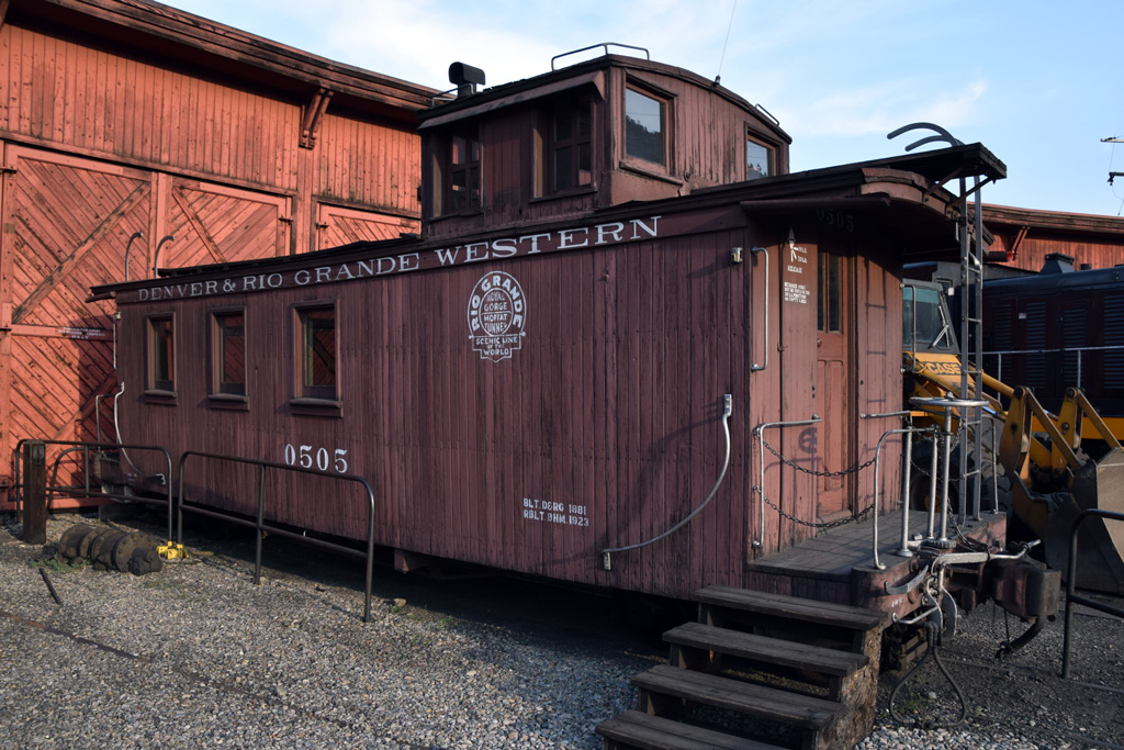 : D&RGW caboose #0505
The term Rio Grande means the river begins in southwestern Colorado and flows to the Gulf of Mexico, the 1950 Western film starring John Wayne, the County in southwestern Colorado, and of course the abbreviation/nickname of a railroad company.
As far as I researched, the term Rio Grande, the abbreviation of the Denver & Rio Grande Railway (1870 – 1880), Denver & Rio Grande Western Railway (1881 – 1889), Rio Grande Western Railway (1889 – 1908), Denver & Rio Grande Railroad (1908 – 1921), or Denver & Rio Grande Western Railroad (1921 – 1988) was first appeared in May 2, 1872, The Colorado People as “The Rio Grande railroad”[1].
On Jun. 17, 1874, Deseret News described the company as “the Rio Grande”[2]. Nov. 11, 1882, White Pine Cone followed it[3]. Accordingly, the abbreviation must have become adequately popular both in Colorado and Utah a decade after the establishment of the company.
Advertisings may be appropriate to search the unveiling of the term Rio Grande expressed by the company itself, as they must be the most frequently printed materials.
As far as I researched, the term was first appeared in the passenger timetable effective summer 1934 as “Have Your Tickets Routed Rio ‘Grande’”[4]. Advertisement on May 23, 1935, Salt Lake Telegram says “the Rio Grande Gives You ROMANCE ADVENTURE and glorious HEALTH”[5]. Advertisement on Sep. 19, 1935, Aspen Daily Times says “Travel the Rio Grande Way”[6]. Next year, the term Rio Grande was featured in its official trademark shown above.
The 1939 flying Rio Grande logo was the first official trademark/logo to be composed only of the term. Finally, by December 1939, the term was determined by the officials as to be established as the popular designation for the railroad[7].
[1] May 8, 1872, “Local and Other Matters”, Deseret News;
[2] Jun. 17, 1874, “New Mexico”, Deseret News;
[3] Nov. 11, 1882, “The Rio Grande Trainmen ”, White Pine Cone;
[4] D&RGW System Passenger Timetable Summer 1934;
[5] May 23, 1935, Salt Lake Telegram;
[6] Sep. 19, 1935, Aspen Daily Times;
[7] Dec. 7, 1939, Park Record;
2019-05-10 09:00
コメント(0)
Flying, 08 – Unveiling of the 1939 Flying Logo [Column_Letters & Figures]
It is said that the unveiling of the flying Rio Grande logo was not on equipment or printed materials but on linen: it was on the headrest covers of the streamlined heavyweight coaches D&RGW #1000 to 1004 assigned for the Exposition Flyer inaugurated on June 10, 1939[1]. In the photo of Matt’s china collection at his web page appears the aforesaid headrest cover[2].
Instead of the flying logo, a large Diploma font “Rio Grande” was applied on the center of the body under the windows of the aforesaid coaches[3]. But this Diploma font lettering was never approved as the company logo and it was later repainted to the flying logo.
Archived photos may be appropriate to search the unveiling of the flying Rio Grande logo on equipment as their dates are obvious. As far as I researched, the first flying logo appears in a photo is of D&RGW NG steam locomotive #473 at Santa Fe, New Mexico, claimed to be taken on surprising March 21, 1939[4].
As far as I researched, the photo of D&RGW #3501 at Helper, Utah, claimed to be taken on July 4, 1939 shows the first flying logo on standard gauge steam locomotive[5]. The photo of D&RGW #1198 at Alamosa, Colorado taken on August 7, 1939 follows it[6].
The June 2, 1939 photo features D&RGW NG stock car #5814 with the flying logo[7]. D&RGW standard gauge caboose #0869 built in 1894 was repainted and applied the flying logo at Burnham Shops in August 1939 and was photographed on September 16, 1939[8]. All steel 40’ boxcar #68000 order placed in July and built in September 1939 was the first new freight car to carry the flying logo according to Rio Grande Color Guide to Freight and Passenger Equipment[9].
Advertisings may be appropriate to search the unveiling of the flying logo on paper as they must be the most frequently printed materials.
The Autumn – Winter 1939 Public Timetable issued in fall of 1939 seems the unveiling of the flying logo on company paper. The passenger timetables featured both 1936 trademark and 1939 flying logo on its cover between fall, 1939 and Feb. 1947.
As far as I researched, it was not until September 22, 1939 when the company released the flying logo in newspaper advertisings[10]. Till then, the 1936 trademark was used, at least until June 1939[11]. The Exposition Flyer Brochure dated June 10, 1939 also used 1936 trademark.
Accordingly, the flying Rio Grande logo seems introduced to the Engineering, Mechanical, and Shops in the first half of 1939, and adopted by the Advertising & Publicity at least in fall 1939. Finally, the flying logo was approved on May 20, 1946[12].
revised, Jan. 14, 2020
revised, Feb. 6, 2020
revised, Jul. 15, 2020
[1] Edwards, Herbert S., (2003) “D&RGW Heralds and Slogans” Vol.2, No.1, The Prospector, The Rio Grande Modeling & Historical Society
[2] Matt, “Rio Grande Table Setting”, SouthwestChief;
[3] Beam, George L., (1939) “Coach 1000”, Denver public Library Digital Collections;
[4] Perry C., Otto, (1939) “The southbound Chili Line passenger train passing the Santa Fe National Cemetery”, Denver public Library Digital Collections;
[5] Perry C., Otto, (1939) “D&RGW Locomotive, engine number 3501, engine type 2-8-8-2”, Denver public Library Digital Collections;
[6] Perry C., Otto, (1939) “D&RGW Locomotive, engine number 1198, engine type 2-8-0”, Denver public Library Digital Collections;
[7] Merle Moore Coll. (1939) “Loading D&RGW stock cars with steers at jack’s Cabin”, Friends of the Cumbres & Toltec Railroad – Historic Photographs;
[8] Perry C., Otto, (1939) “D&RGW car number 0869 and car number 01123”, Denver public Library Digital Collections;
[9] Neubauer, Eric A., (2014) Pressed Steel Car Railcar production, ericsrailroadcarhistory.com;
[10] Sep. 22, 1939 Aurora Democrat;
[11] Jun. 16, 1939, Pleasant Glove Review;
[12] “Lettering Streamlined ‘Rio Grande’”, D&RGW Office of the Mechanical Engineer, Denver, CO. May 20, 1946, Card 20823, File M-290
 : Autumn – Winter 1939 Public Timetable
2019-05-17 09:00
コメント(0)
Flying, 09 – Painted Logos and Printed Logos [Column_Letters & Figures]
Have you ever noticed that there are two kinds of flying logos? The one is widely painted on equipment and facilities, and the other is used in printed materials like company papers or newspaper advertisements. The photo above shows the flying logo painted on a boxcar, and below shows the flying logo printed on the cover of the company telephone directory, both appeared new in 1963.
As you can see, the major differences between the two are:
1) The proportion (width and height) of the entire logo,
2) The end of the stroke of the letters "r" and "e".
Compared with the painted logo, letters used in the printed logo are condensed, and also is the space between "Rio" and "Grande". These make the proportion of the entire printed logo rather short.
The end of the stroke of the letter "r" in the printed flying logo is shortened, cutting the end parallel to the tilted vertical baseline. The end of the stroke of the letter "e" in the printed flying logo is also shortened; making the letter looks somewhat like Pac-Man.
The original flying Rio Grande logo appeared in the headrest covers of the Exposition Flyer coaches in June 1939 was the painted flying logo. The printed flying logo appeared about four months after the painted logo. My guess is that the designer at the Advertising & Publicity office spent that time on arranging the original logo.
The sizes of printed logos are, as a matter of course, considerably tiny compared to painted logos when they are provided. For better visibility and/or appeal, the designer might well think of using larger type. But the space in the given print layout might be limited. Then, the designer might well condense the letters and shorten the ends of the stroke without spoiling the original image. Shortening the end of the stroke would also prevent the spaces from filling up.
Both the painted and printed flying logos survive to this day: Union Pacific SD70ACe #1989, the Heritage Unit unveiled in 2006, had large painted logo on side and small printed logo on nose[1]. But the logo on side was repainted with large printed logo in 2017[2]. San Louis & Rio Grande locomotives have printed logo inspired large logos on side[3].
[1] 2006 photo of UP #1989 at DRGW.NET site;
[2] 2017 photo of UP #1989 at Railroad Picture Archives site;
[3] 2009 photo of SLRG #8527 at Railroad Picture Archives site;
 : 1939 logo on System Telephone Directory printed May 1963
2019-05-24 09:00
コメント(0)
Flying, 10 – Unveiling of the 1966 Stacked Logo [Column_Letters & Figures]
 : 1966 logo on D&RGW XM #63043, built Apr. 1968
In 1948, the 1939 flying Rio Grande logo was absorbed into the “Thru the Rockies” trademark[1]. But the 1939 logo was kept widely used on equipment and locomotives. The last built-new locomotive to wear the flying logo was D&RGW SD45 #5333 and 5335 built in May 1968, and the last built-new freight equipment to wear the flying logo was D&RGW XM #63842 built in November 1966 by Pullman-Standard.
Finally, in November 1966, the “stacked” logo was approved[1]. As early as February 1967, D&RGW RBL #51000 appeared with the stacked logo. Gondola car D&RGW #30170 also built in February followed it.
D&RGW SD45 #5337 repainted in September 1968 is the first locomotive to wear the stacked logo[2]. GP40 #3081 built in October 1969 is the first built-new locomotive to wear the stacked logo.
As far as I researched, it was not until March 1967 when D&RGW launched the stacked logo in newspaper advertisings[3]. Till then, the 1939 flying logo was used, at least until December 1966[4]. Passenger Timetable issued in June 1967 carries the flying logo, and Timetable issued in October same year carries the stacked logo.
[1] Edwards, Herbert S., (2003) “D&RGW Heralds and Slogans” Vol.2, No.1, The Prospector, The Rio Grande Modeling & Historical Society
[2] Strapac, Joseph A., (1984) Rio Grande Diesels A pictorial History – Vol. 2, Shade Tree Books
[3] Mar. 23, 1967, Times-Independent;
[4] Dec. 30, 1966, Davis County Clipper;
2019-05-31 09:00
コメント(0)
arx_Ph.D. さん

Here represented are my model railroad enthusiasm generated from the photos I took during my childhood at Knoxville, Tennessee, or from the photos I took during my recent trips.
I'm a retired professor of design, meanwhile a part-time associate at the architectural design office in Osaka, Japan where I live with my wife.


