Typologies, part 2 – Crossbucks [Column_Photo Archives]
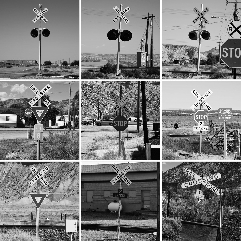 : crossbucks
Here are another “automatically arranged formal photos of same at a glance objects”[1]. These are, of course, photos of crossbucks. To tell the truth, the photos are trimmed and scaled to gray. These make this typologies style representation.
There are more quality examples among railroad photography. Richard Steinheimer presents station signs and locomotive portraits in this way in his book Western Trains[2]. Trains magazine cover shows locomotives in this way[3]. The so-called roster photos maybe also classified as typologies. Accordingly, it seems that objects of railroad photography are suitable for typologies style representation.
Most of the objects of railroad photography are mass-produced industrial products. That is, they look same at a glance; most of the people call the locomotive just “train” whether it’s EMD or GE. But for us, they are definitely different. We capture the identity by way of revealing the scanty differences through careful observation; same way Bechers do. Accordingly, method of railroad photography may resemble to typologies style representation. But it seems chicken-and-egg problem, telling which, object or method of railroad photography, led typologies style representation.
It’s also difficult to tell who established the typologies style representation. Steinheimer’s two mini series were first published in1965, and Bechers’ first exhibition was held in 1963. Both maybe started taking their particular photos in the same era. Jeff Brouws also mentions Campbell’s Soup Cans produced in 1962 by Andy Warhol on this matter[4]. I also want to add Twentysix Gasoline Stations published also in 1962 by Ed Ruscha[5]. Thus, it’s difficult to tell who, Steinheimer, Bechers, Warhol, Ruscha or someone else, established the typologies style representation. I may say that it was such an era.
[1] my column Typologies, part 1;
[2] Richard Steinheimer, Western Trains, 1965
[3] for example, June 1968 and July 1978 issue of Trains magazine
[4] Campbell’s Soup Cans by Andy Warhol;
[5] Twentysix Gasoline Stations by Ed Ruscha;
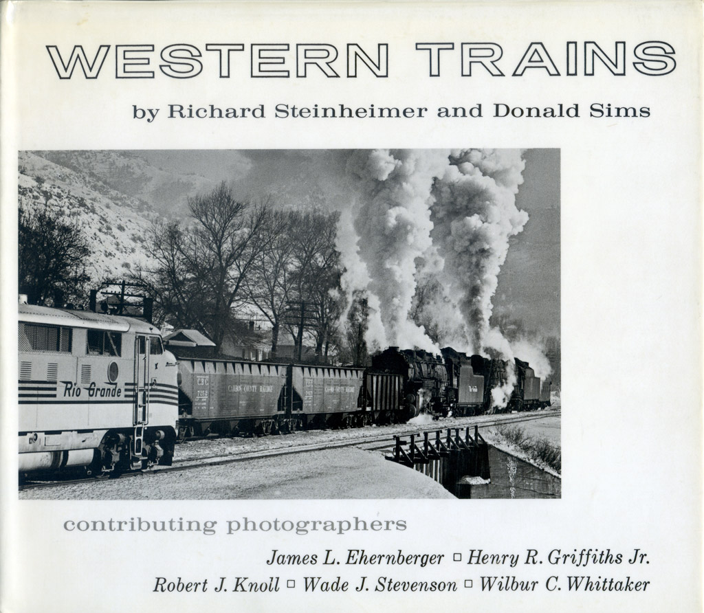 : Richard Steinheimer, Western Trains, 1965
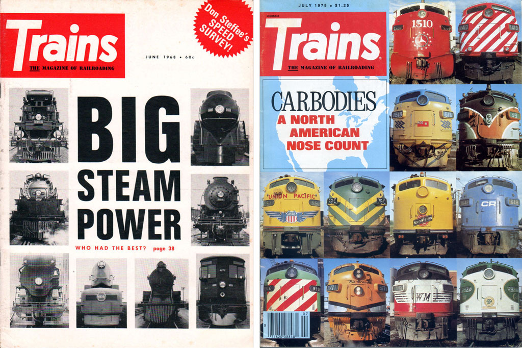 : covers of Trains magazine
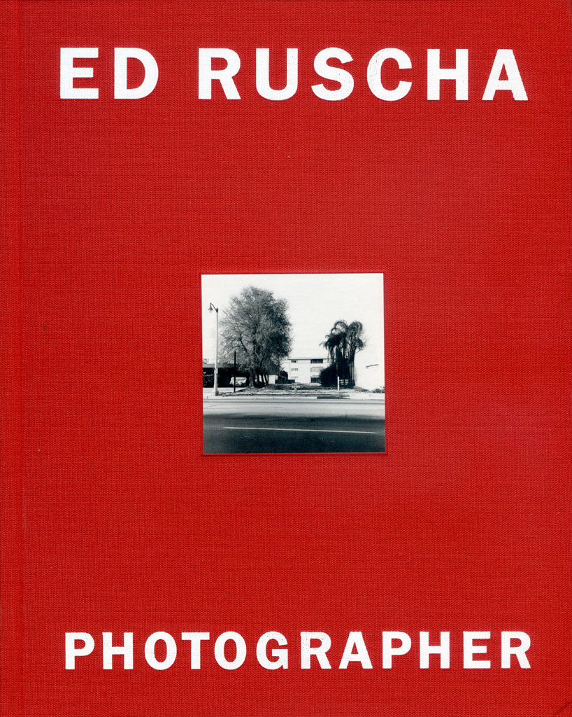 : Ed Ruscha, Photographer, Whitney Museum of American Art, 2006
上に示したのは、crossbuckと称せられる踏切に建つ標識の写真である。トリミング・モノクロ変換して並べると、前に記したベッヒャー夫妻によるトポロジー的表現手法による提示に見える。鉄道写真におけるトポロジーの試みだ。
このような手法による提示は以前からある。Richard Steinheimerによる駅名標や機関車の顔をとらえたシリーズや、雑誌Trainsの表紙、それにいわゆる型式写真の類もトポロジー的表現手法による提示といえるだろう。これらの事例における被写体はいずれも大量生産された工業製品である。つまり、よく似ている。例えば鉄道旅客車両は、一般人にとってはただ「電車」とだけ認識されがちだ。しかし、わたしたちはそれらのわずかな差異をとらえ、電車・気動車・客車更には何系といった固有性を見極める。その手法はトポロジー的表現手法に似ている。
このように、鉄道写真の被写体および手法はベッヒャー夫妻のトポロジー的表現手法に近しいといえる。被写体が似ているから手法も似るのか、あるいはその逆かはなんとも分からない。ただ、Steinheimerもベッヒャー夫妻も、同じ頃にこの手法を始めている。「キャンベルのスープ缶」(1962年制作)で一躍ポップアートの雄となったウォーホルや、「26のガソリンスタンド」(1962年制作)を出版したエド・ルーシャを加え鑑みれば、トポロジー的表現手法は、1960年代初めという時代が要請したものなのかもしれない。
2015-07-10 09:00
コメント(0)
arx_Ph.D. さん

Here represented are my model railroad enthusiasm generated from the photos I took during my childhood at Knoxville, Tennessee, or from the photos I took during my recent trips.
I'm a retired professor of design, meanwhile a part-time associate at the architectural design office in Osaka, Japan where I live with my wife.


コメント 0