Speed Lettering 23 − Sense of Speed caused by Effect lines, 2 [Column_Schemes & Paints]
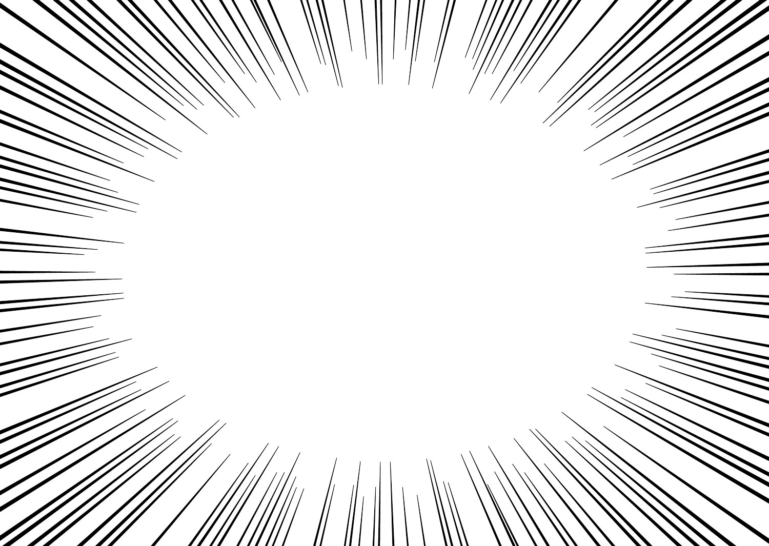 : radial MANGA effect lines
In my past post, I mentioned the sense of speed brought by “wedge shape”, “oblique position”, or “shadows or blur”, which are obviously appeared in MANGA effect lines.
MANGA effect lines are made of parallel or radial lines, as you can see above. My past post explained railroad logos referring to the effect of parallel lines. In this post, I’ll explain the railroad heralds and beyond referring to the effect of radial lines.
The significant feature of the radial MANGA effect line is that it has a void core. I recalled two railroad heralds that satisfy this condition: Union Pacific’s shield herald with wings and Gulf, Mobile & Ohio’s winged herald.
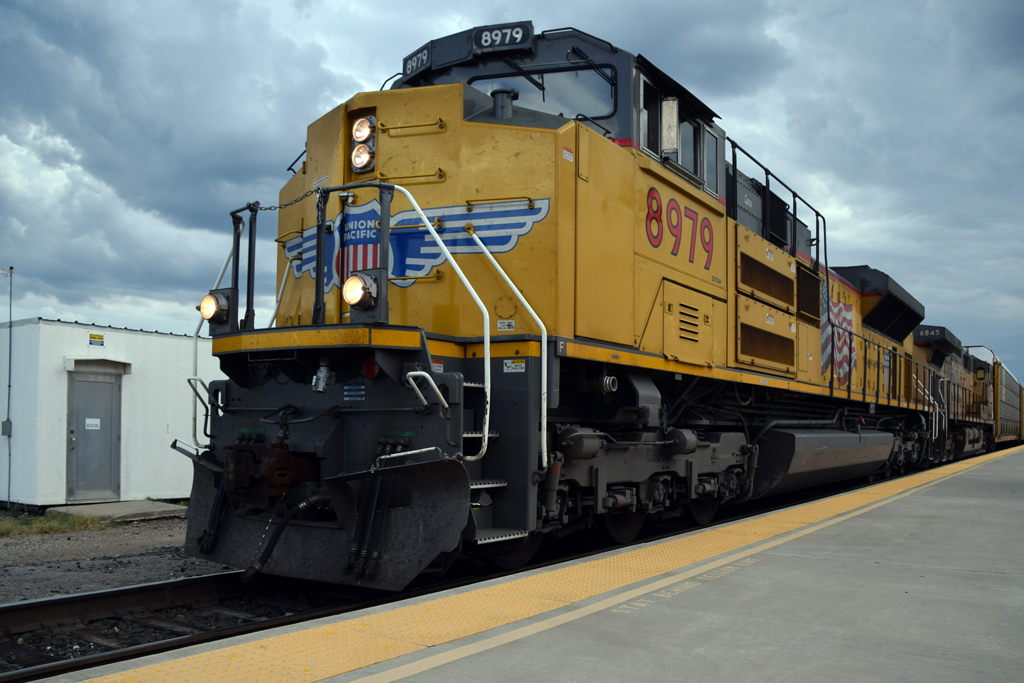 : Sep. 10, 2015. Alpine, TX
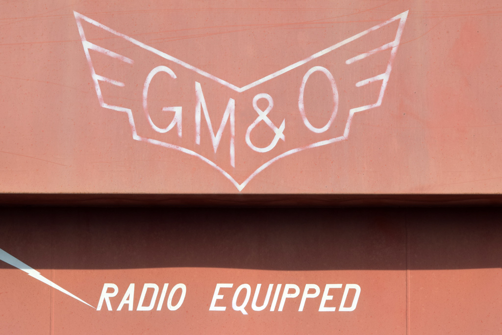 : Sep. 11, 2019. Monticello, IL
Union Pacific’s shield herald acquired wings in 1939 when EMC E3A #LA-5 was delivered from La Grange, IL.
Gulf, Mobile & Ohio predecessor Gulf, Mobile & Northern Railroad adopted its winged logo in 1935 when the railroad introduced the “Rebel” streamliner built by AC&F. The winged logo was succeeded by GM&O in 1940.
Both the heralds are first applied on the slant nose of the lead equipment. Also is that both the heralds are symmetrically applied with the ridge of the slant nose.
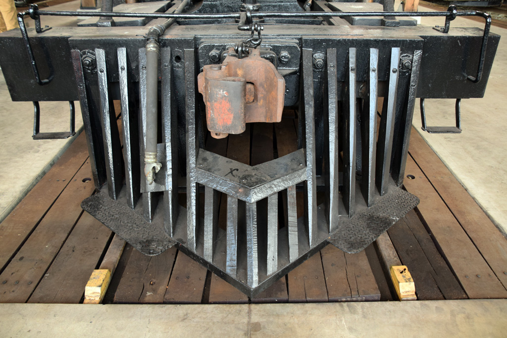 : Sugar Creek, OH. Sep. 7, 2019
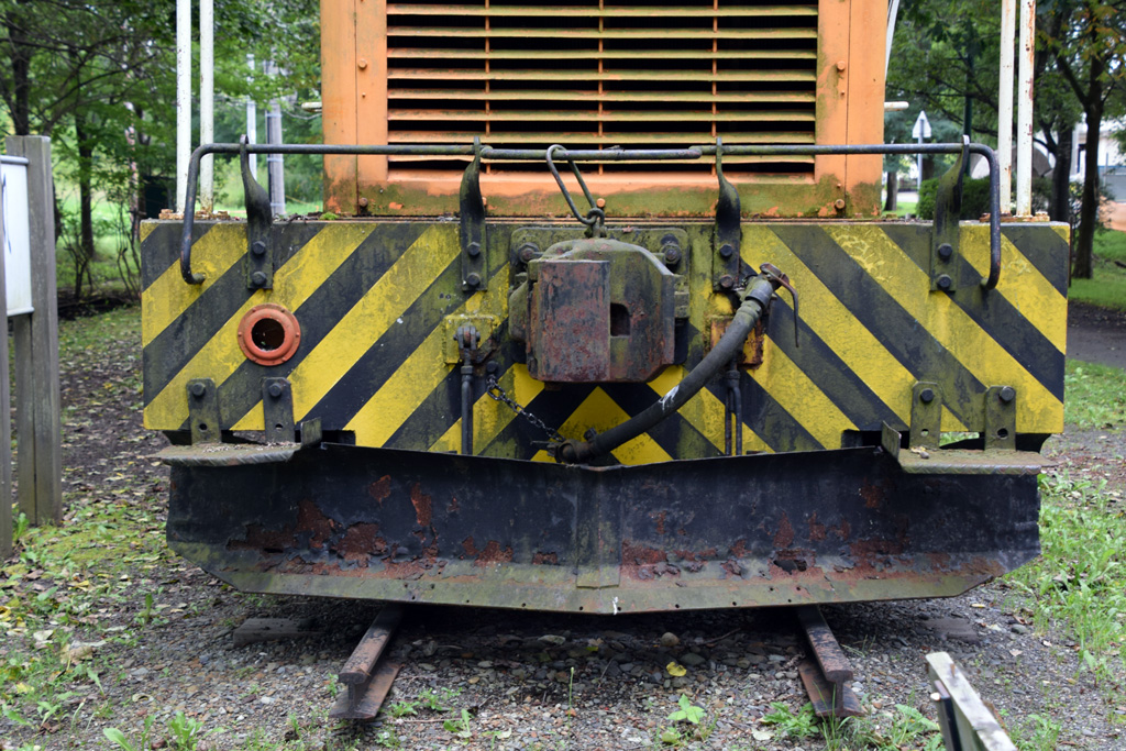 : Ebetsu, Hokkaido, Japan. Aug. 26, 2018
Here, we can extract the terms of developing radial MANGA effect lines on railroad equipment: void core, lead, slant, and symmetry. The terms remind me of the cowcatchers and thus the safety stripes on end. They are also adopted at the lead. They lack cores but are occupied by couplers. And, they are slant and symmetrical as you see above. Therefore, I may say that the winged heralds, the cowcatchers, and the safety stripes are all the results of developing radial MANGA effect lines.
Timeline? The Chōjū-jinbutsu-giga (Frolicking Animals Handscroll/鳥獣人物戯画), the earliest drawing/manga adopting effect lines, is said to be drawn between the 12th and 16th century.
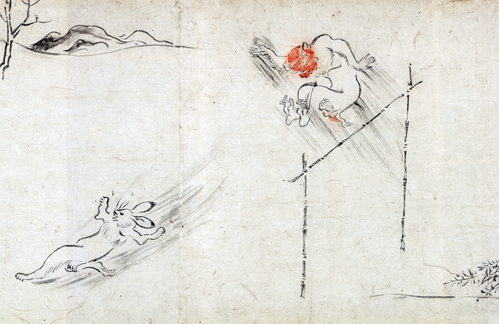 : part of Chōjū-jinbutsu-giga
 : visual for Apple Event
 先に、漫画の流線を手掛かりに、鉄道会社のスピード感あるロゴマークの成り立ちについて記した。その記事で援用した流線は先端が不揃いな平行線群だった。今回は流線のうち集中線と称せられる放射状の線群を手掛かりに、鉄道車両に施される様々な表記について考察する。
集中線の最大の特徴は、その中心が空白であることである。この要件を満たす表記としてまず思い付くのは、Union Pacificの機関車の鼻先に施された羽根つきのヘラルドである。Gulf, Mobile & Ohioの羽根を模したヘラルドもそうだろう。
Union Pacificの羽根つきヘラルドは1939年新造の機関車に鼻先に施されたのが最初。一時消えていたが2000年に復活している。Gulf, Mobile & Ohioの羽根型ヘラルドは、前身であるGulf, Mobile & Northernが1935年に導入した流線型気動車の鼻先に施されたのを継承したもの。いずれも集中線の中心はロゴマークやロゴタイプに隠れて見えない。
これらヘラルドのデザインにおける特徴は、先頭車両正面の傾斜ある鼻先に、中心線に対し左右対称に施されることにある。つまり、これらヘラルドは、先頭車両正面の傾斜ある鼻先に中心線に対し左右対称に施された、中心が空白の放射状の線群としてとらえることができる。
これら要件を聞いて、他の鉄道車両に附属するもので想起されるのが、カウ・キャッチャーおよび警戒塗装である。いずれも端梁に左右対称に施され、その中心は連結器を取り付けるため空いている。すなわち、羽根つきヘラルド、カウ・キャッチャー、警戒塗装は漫画における集中線を鉄道車両に適用したものといえる。
漫画よりカウ・キャッチャーの方が先だろう?否、漫画流線の元祖とも称せられる鳥獣人物戯画が描かれたのは12〜16世紀である。
2021-09-10 09:00
コメント(0)
arx_Ph.D. さん

Here represented are my model railroad enthusiasm generated from the photos I took during my childhood at Knoxville, Tennessee, or from the photos I took during my recent trips.
I'm a retired professor of design, meanwhile a part-time associate at the architectural design office in Osaka, Japan where I live with my wife.


コメント 0